The midday shift and what it does to white
South-facing light is often described as a gift, constant, generous, golden. And it is. But the real secret is that it changes everything you thought you knew about colour. A shade that looks calm on the swatch can feel harsh by noon, and a colour you’d never consider in a north-facing room suddenly becomes the most natural choice. The trick is learning to read the light rather than fight it.
Nowhere is this more obvious than with white paint. In a south-facing room, warm light can make cool whites, think a crisp Farrow & Borrow All White, look clinical, like a dentist’s surgery. Meanwhile, warm whites with a yellow base can turn custard-y by midday, losing all their subtlety. The solution? Off-whites with a whisper of green or grey. A shade like Little Greene’s Slaked Lime or Paint & Paper Library’s Lime White holds its composure because the green or grey undertone absorbs some of the golden light rather than reflecting it back at you. Test a patch on three different walls, north-facing, east-facing, and the main south wall, and watch it shift between 11am and 3pm. That’s the only honest test.
Let the windows set the temperature
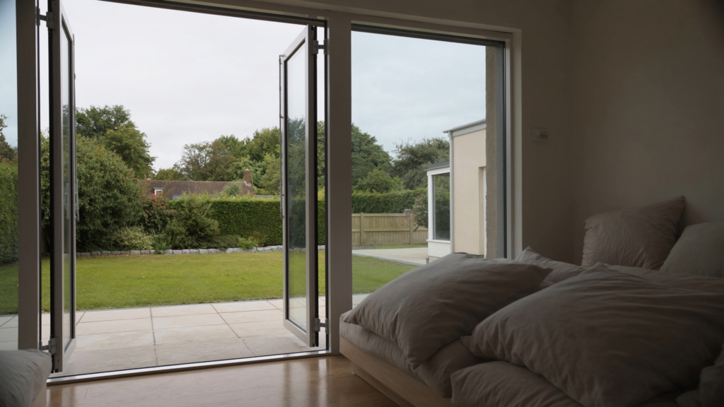
Your windows aren’t just holes in the wall; they’re filters. Modern double or triple glazing reduces UV intensity, which is good for your furniture, but it can also shift the colour temperature of the light entering the room. Low-E glass, in particular, sometimes makes interiors feel cooler than expected, like the sun is there but its warmth has been muted. If that’s your situation, you’ll want paint tones that compensate without feeling forced. A warm taupe or a clay-based neutral will bring back the cosiness that the glass has quietly stolen.
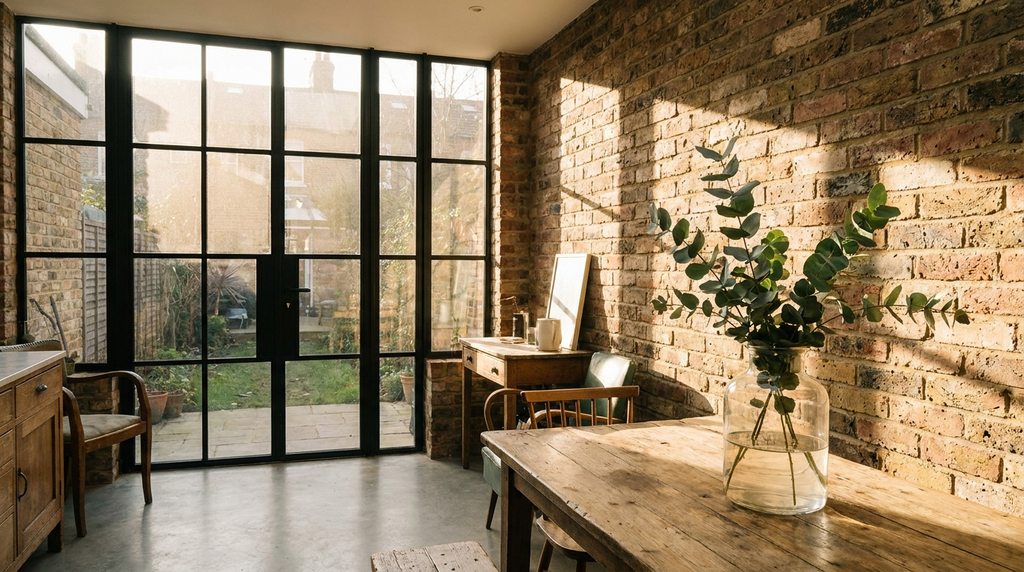
Then there’s the frame itself. A white uPVC frame bounces light around the room, making colours feel brighter and cooler. A dark grey or timber frame absorbs some of that light, which can make adjacent walls feel richer and more grounded. If you’ve got black-framed windows, you can afford to go slightly lighter on the walls because the frame provides the contrast. If your frames are white, consider a slightly deeper wall colour to balance the bounce.
Eight ways to soften a tall sash window
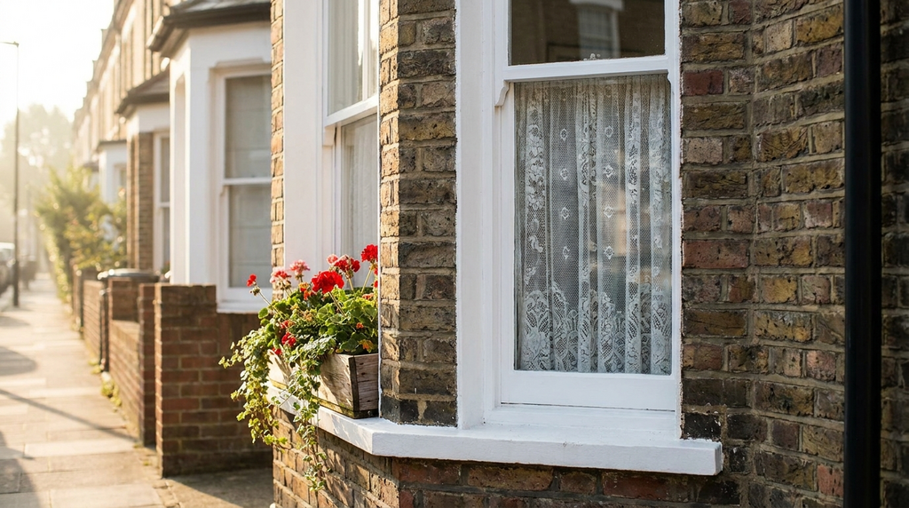
Tall sash windows are a blessing, but they can also turn a room into a glare-box by 2pm. Here’s how to soften them with paint and fabric:
- Paint the flanking walls deep. A slate blue, deep olive, or earthy terracotta absorbs light rather than reflecting it, reducing glare and creating a sense of depth.
- Treat the window reveal as a deliberate colour block. Paint it a shade darker than the wall, or a complementary tone, so it frames the view rather than competing with it.
- Use sheer-lined roman blinds. They filter light before it hits the paint, softening the colour on the wall and reducing contrast.
- Choose a matte finish. Eggshell and satin can bounce light into uncomfortable sparkle in a south-facing room. Flat or matte paint absorbs, soothes, and hides imperfections.
- Add a deep cornice colour. Paint the ceiling a tone darker than the walls to pull the eye down and make the window feel less dominant.
- Hang curtains from ceiling height. Even if they’re purely decorative, they break up the vertical line of the window and add texture.
- Use a contrasting colour on the window frame itself. A dark grey or black frame against a pale wall creates a crisp edge that stops the light from bleeding.
- Consider a limewash finish on the wall. The subtle mottling catches light differently at every hour, so the wall never feels flat or washed out.
Pick a colour that softens with the seasons
The best paint colours for south facing rooms are the ones that shift gracefully with the light. Think muted ochres, sage greens, dusty pinks, and clay tones. In strong summer light, these colours look more saturated, almost juicy. But come January, when the sun sits low and pale, they reveal their quieter, chalkier side. A sage green like Farrow & Ball’s French Gray or a dusty pink like Setting Plaster feels warm in winter without feeling oppressive in July.
Neutrals with a brown or taupe base are particularly clever. A shade like Drop Cloth or Elephant’s Breath holds a soft warmth in low winter light but reads as a calm, grounded neutral in summer. The trick is avoiding anything with a strong yellow or orange undertone, those colours can feel overwhelming when the sun pours in. Instead, look for greiges and taupes that have a whisper of grey to keep them cool enough for July.
Why texture matters more than colour
Here’s something that contradicts every paint chart you’ve ever seen: texture matters more than colour in a south-facing room. A flat or limewash paint finish absorbs light differently from a high-sheen. When light is abundant, a flat finish softens and diffuses, while a high-sheen bounces it around like a disco ball. That’s why a deep colour in a matte finish can feel calm and enveloping, while the same colour in eggshell can feel harsh and reflective.
Rough plaster, lime render, or wood panelling also changes how a colour is perceived throughout the day. The shadows cast by texture break up large south-facing walls so the colour doesn’t feel monotonous, even in full sun. If you’ve got a plain plastered wall, consider adding a limewash or a rough trowel finish before painting. The cost is around £400 to £1,200 depending on size and finish, but it transforms how the colour lives in the room.
The one room where you can go dark
There is one room where you can ignore almost all of this advice: the room that gets unrelenting, almost aggressive south light. A conservatory, a sunroom, a wide bay window with no shade, these spaces need a deep, enveloping colour. Dark paint in a south-facing room doesn’t create gloom; it creates intimacy. The light keeps it alive, bouncing off the pigment rather than drowning it.
Think charcoal blue, aubergine, deep olive. A shade like Little Greene’s Basalt or Farrow & Ball’s Railings feels grounded, not heavy, when the sun pours in. The key is the finish: matte, always matte. And pair it with warm wood or brass accents to stop it feeling cold. In these rooms, you’re not fighting the light, you’re giving it somewhere to land.