The colour that greets you home
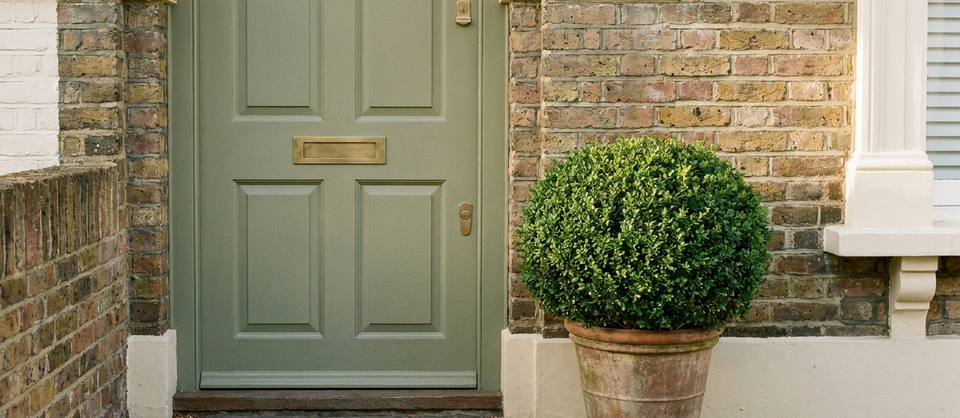
Most front doors are chosen for the street. You stand on the pavement, squint at the brickwork, and pick something that won’t embarrass you when the postman arrives. But the person who sees that door most often is you, arriving home at dusk, keys in hand, shoulders tired. A dusty green shifts this dynamic entirely. It is not a colour chosen for neighbours; it is a colour chosen for the quiet moment when you turn the key and the house welcomes you back.
What you get is a front door that looks like it belongs to the house, not to a catalogue. And one that quietly improves every time the light changes, from the dim, grey hour before dawn to the long golden stripe of a summer evening.
Let your front door do the heavy lifting
A dusty green reads as deliberate, not decorative. It signals that someone cares about the threshold, that the entrance to the home was considered, not just painted. Unlike a bright red or a navy blue, which announce themselves from the end of the road, a sage olive front door pulls you in. It absorbs the visual noise of brick, stone, render, or even a plain white porch, and gives you something to rest your eyes on.
This is the one spot on the house where colour can be both bold and restful at the same time. A well-chosen dusty green doesn’t shout; it settles. And because it sits in that rare territory between neutral and statement, it works on a Victorian terrace, a 1930s semi, and a modern timber-clad box alike.
Pick a colour that softens with the seasons
The best sage greens are not flat. They shift. A sage olive holds its own against autumn leaves and spring blossom without clashing, it is the colour that ties the garden to the house. In low winter light it deepens, pulling warmth from the grey sky. In summer it reads almost silvery, catching the sun like a dusty leaf.
Look for pigments with a grey or brown undertone, not a yellow one. A yellow-based green tips into mint, and mint on a front door reads as a choice made in haste. Instead, seek out shades like Farrow & Ball’s Lichen or Sage Green, Little Greene’s Olive, or a custom mix that leans toward the olive grove rather than the garden shed. The difference is subtle on a colour card and enormous on a full door in morning light.
The frame is not an afterthought
A sage front door needs a frame that doesn’t shout. White can feel stark, as though the door has been dropped into a hole cut from paper. Dark charcoal anchors it, giving the green something solid to lean against. For a softer approach, paint the frame the same colour but a shade darker, this creates a quiet depth that rewards close looking.
The architrave and letter plate matter just as much. Brass, unlacquered so it will patina over time, or oil-rubbed bronze both sit beautifully against a dusty green. Avoid polished chrome or bright silver; they introduce a cold note that the green can’t warm. A warm black on the frame, paired with a sage door, gives you a threshold that feels both grounded and generous.
Why texture matters more than colour
A flat sage door on a smooth house can look flat, literally. The colour needs something to catch on. Wood grain, a raised panel, or a vertical slat detail gives the green depth, letting light move across the surface as the day passes. Even a subtle matt finish adds a tactile quality that gloss never can. Gloss bounces light away; matt absorbs it, pulling the colour into the grain of the wood.
If your door is a simple flush panel, consider adding a timber bead or a slim horizontal detail. Or choose a paint finish with a low sheen, eggshell or a modern microporous matt, that lets the surface breathe. The green will read differently in shadow and sun, and that variation is what makes the door feel alive rather than painted.
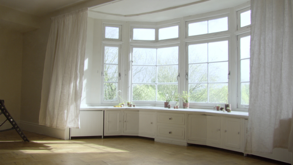
Eight ways to soften a tall sash window
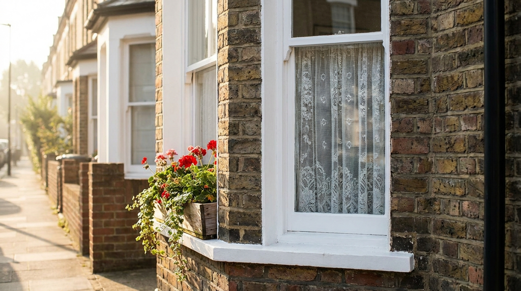
Place a sage front door next to a tall sash window and the two can compete, or complement. The key is to let them speak the same language without shouting. Here’s how:
- Paint the sash in a tone from the door’s undertone, not a match, a soft warm grey or a muted taupe works.
- Use the window to frame a view that echoes the door’s colour, a potted olive, a clipped box ball, a terracotta urn.
- Keep the window furniture restrained: black iron or unlacquered brass, matching the door’s hardware.
- Consider a Roman blind in a natural linen; it softens the glass and connects the interior to the door’s earthy tone.
- If the window is original, respect its proportions. A sage door next to a tall sash works best when both are simple and unadorned.
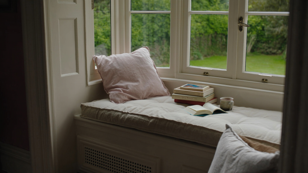
- Add a slim shelf at the sill with a single object, a stone bowl, a stack of books, that picks up the green.
- Avoid heavy curtains or blinds that compete with the door’s presence; the window should frame, not fight.
- In winter, place a bare branch of eucalyptus or a sprig of rosemary in a small vase on the sill, the colour echoes the door.
Hardware that earns its place
Brass ages beautifully against sage olive. It warms the green without fighting it, and as the brass dulls and darkens, the two colours grow into each other. Black iron reads more architectural, more Georgian or Victorian in spirit, and it gives the door a quiet authority. The handle, knocker, and hinges are the jewellery: keep them restrained, keep them honest.
A single statement handle in a warm bronze, paired with a slim letter plate and a plain round knob, is enough. Too many fittings clutter the composition. And if you choose brass, choose unlacquered. The patina that develops over months is part of the door’s story, and a sage green door deserves a story that deepens with time.
The threshold tells the story
A sage door on a concrete step feels unfinished. The colour demands a grounding, a stone step, a brick riser, or a painted step in a deep charcoal or a warm stone grey completes the composition. A deep green door wants a welcome that doesn’t compete. A woven mat in natural fibre, coir, seagrass, hemp, sits quietly beneath it, absorbing dirt and noise without introducing a bright slogan or a jarring colour.
The moment you step over the threshold should feel like the colour has been waiting for you. That is the difference between a door chosen for the street and a door chosen for the person who comes home. The dusty green doesn’t just sit there; it holds the space, softens the light, and tells you, without a word, that this is your place to land.