Why the front door sets the tone for everything behind it
The first thing you notice on a November afternoon, before the letterbox rattle, before the key finds the lock, is the colour. A front door holds the light differently at 4pm than at noon. It greets you before you’ve even stepped inside. And on those grey, shortening days, when the rest of the street has retreated behind net curtains and porch lights, your front door is the one thing that says someone lives here, and someone thought about it.
Yet most of us default to the safe trio: black, sage, navy. Respectable, yes. But they’re the beige of front doors now, so common they’ve stopped saying anything at all. Choosing a shade beyond these defaults transforms a standard entrance into a deliberate design statement. It signals warmth, restraint, or quiet confidence before anyone has even pressed the bell. A home that feels curated, not copied, starts at the threshold.
Let your front door do the heavy lifting
A bold colour compensates for a modest porch, a narrow hallway, or a featureless facade. When the architecture is quiet, a plain Victorian terrace, a postwar semi with a flush timber door, the colour becomes the focal point. It does the work that a portico or fanlight might have done in a grander house.
Consider deep aubergine, burnt terracotta, or a muted ochre. These are colours that read as intentional rather than accidental. They don’t shout; they present. Pair them with brass or unlacquered bronze hardware to ground the intensity. A bright door with cheap chrome handles looks like a mistake. The same door with a heavy bronze letterplate looks like a collector’s piece.
Pick a colour that softens with the seasons
A front door colour palette should work in low winter light and high summer glare. Test swatches at different times of day, that vibrant coral that sings at noon can look flat and chalky by 3pm in December. Slate blue-grey reads as cool in July but warm in December; a chalky pink softens rather than shouts year-round.
Avoid colours that bleach out in sun or turn muddy under cloud. Look for pigments with a hint of earth or clay, they hold their nerve when the light changes. A colour with too much white pigment will look washed out on a dull Tuesday. A colour with a touch of raw umber or burnt sienna will deepen and settle, like a good tweed coat.
Six unexpected shades that work on period and modern homes
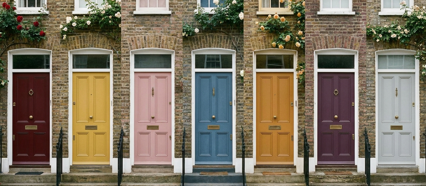
Here are six shades that step beyond the obvious. Each one has been tested on brick, render, and stone, and each one earns its keep across the seasons.
- Smoked paprika, rich, warm, unexpected on Victorian terraces. It plays beautifully with buff brick and cream stone, and looks particularly good against a glossy black railing.
- Petrol blue, darker than teal, greener than navy. It suits Edwardian and mid-century homes equally, and holds its depth in shadow.
- Clay pink, not blush, not salmon. A dusty, grounded pink that softens white render and grey slate. It’s the colour of a terracotta pot that’ been rained on for a decade.
- Forest gloom, a deep, almost-black green with brown undertones. Quieter than sage, more character than black. It reads as green only when the light catches it.
- Saffron, a tempered yellow with amber leanings. It lifts a north-facing entrance without screaming. On a grey day, it glows.
- Charcoal violet, reads as grey from a distance, purple up close. It shifts with the weather and the hour, and looks extraordinary with unlacquered brass.
Why texture matters more than colour
Here’s the thing nobody tells you: a flat, matt finish on a glossy colour feels unresolved. The finish carries as much weight as the pigment. Eggshell or satin on timber doors catches light and reveals grain; dead flat on an exposed front door looks like undercoat. It’s the difference between a silk shirt and a cotton one, both can be beautiful, but they behave differently in the world.
Consider a micro-ribbed or vertical-grooved door panel. Texture adds depth even before the colour registers. A grooved door in clay pink catches shadow in its lines, creating a play of light that a flat panel never could. The same colour on a smooth door can feel flat; on a textured one, it feels architectural.
Let the hardware lead the palette
Choose the door colour after selecting the handle, knocker, and letterplate. Metal tones anchor the scheme. Unlacquered brass warms aubergine and petrol; blackened steel cools clay pink and saffron; polished nickel suits blue-greys. A mismatched metal finish reads as collected, not careless, but limit to two tones maximum. Three starts to look like a salvage yard.
If you’re unsure where to start, pick the hardware first. Find a handle that makes you want to touch it, a heavy brass lever, a cast-iron ring knocker, and then find the colour that makes it sing. The metal will tell you whether the colour needs warmth or coolness, weight or lightness.
How to test a front door colour palette without committing
Paint a 50cm square of MDF and lean it against the door for a week. Watch it in rain, dusk, and direct sun. Photograph it on an overcast day, the truest test is flat grey light, not golden hour. That romantic glow at sunset will flatter any colour; the real question is whether it still works at 8am on a drizzly Tuesday.
If the colour makes you smile each time you arrive, it’s the right one. Trust instinct over trend. A front door is not a feature wall, it’s a daily encounter. It should feel like a small, private pleasure, not a statement you have to defend to visitors. And if it does, you’ve chosen well.