The light that never arrives
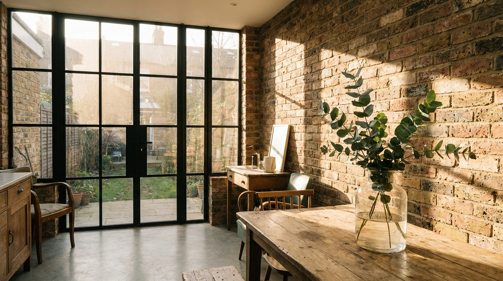
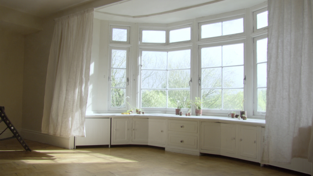
You know the moment. It’s three in the afternoon, and you’re standing in your north-facing kitchen, the room you painted “warm white” six months ago, wondering why it looks like the inside of a fridge. The light is flat, grey, ungenerous. You’ve rearranged the furniture, added a mirror, swapped the lightbulbs for something brighter, and still, the room feels like it’s waiting for a sun that never comes.
Here’s what no one tells you about north-facing rooms: they don’t need more light. They need a different kind of colour. The cool, blue-toned daylight that filters through a north-facing window never warms to gold or pink the way a south-west room does at sunset. It stays cool all day, every day. And if you try to fight it with bright whites or cream, the room doesn’t just look flat, it looks clinical, chalky, dead. The white you thought would “open things up” turns into a greyish smear, like skimmed milk on a rainy Tuesday.
The quiet observation that changes everything: the best north-facing rooms don’t pretend the sun is there. They work with the coolness. They lean into it. And they come out feeling intentional, not accidental.
Start with the undertone, not the colour name
The reason “magnolia” or “cream” fails in a north-facing room is simple: the yellow base in those colours clashes with the blue light. The result is sour, muddy, unsettling, like a photograph with the white balance set wrong. You can’t fix it with a brighter bulb or a bigger mirror. You have to change the colour itself.
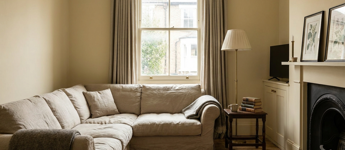
The shift is subtle but transformative. Warm-grey, blush, soft mushroom, these are the colours that absorb the coolness and reflect back something human. A warm-grey reads as stone in the morning, charcoal velvet by evening. A blush doesn’t scream pink; it whispers warmth, like the inside of a seashell. A mushroom tone holds its nerve where a beige would curdle.
The gain for you, the homeowner: a room that finally behaves. The relief of walking into that kitchen at 3pm and feeling like the colour was chosen on purpose, not by accident. The room stops feeling like a problem to solve and starts feeling like a room you want to spend time in.
Five paint colours that hold their nerve in north facing rooms
These aren’t swatch codes. They’re characters. Each one has been tested against the grey of a British north-facing room, and each one holds its ground.
- Farrow & Ball’s “Shaded White”, A stone that glows rather than retreats. It’s not white at all; it’s a pale, warm grey with the faintest lift of yellow. In north light, it reads as soft, aged plaster, the kind of wall that looks like it’s been there for a hundred years, quietly absorbing the weather.
- Little Greene’s “French Grey Pale”, Green-grey that reads as soft shadow. This is the colour of a garden wall in the rain, or a lichen-covered stone. It doesn’t fight the blue light; it harmonises with it, turning the room into a calm, leafy retreat.
- Paint & Paper Library’s “Slate III”, Dark but breathing, not heavy. This is the shade you paint the back wall of a north-facing study, the one that pulls you into the room rather than letting your eye drift to the grey window. It’s deep enough to feel cosy, but the green undertone keeps it from feeling like a cave.
- Mylands’ “Marble V”, Warm without being yellow, like aged plaster. This is the colour that makes a north-facing bedroom feel like a hotel suite in the Cotswolds, soft, expensive, and utterly unbothered by the weather outside.
- Earthborn’s “Grey Moss”, A clay-based finish that catches what little light there is. The texture itself matters here: Earthborn’s paint has a mineral, matte quality that absorbs and diffuses light differently than a standard emulsion. The colour sits softly on the wall, like a breath rather than a statement.
Why texture matters more than colour
I once saw a north-facing living room that had been painted in what should have been the perfect shade, a warm, muted stone. But it still felt cold. The missing layer was tactile. The walls were painted in a standard vinyl matte emulsion, which absorbs light like a sponge. Every photon that hit that wall disappeared into the finish, leaving the room feeling flat and lifeless.
The fix was simple: switch to an eggshell or a mineral paint. Eggshell bounces light softly, like skin. Mineral paints, like the clay-based finishes from Earthborn or the limewashes from Bauwerk, catch the light in their undulations, creating depth without a second coat. A single wall in limewash, with its subtle striations and chalky surface, turns the room from a flat box into a space that feels alive, even when the light is low.
The lesson: you can paint the perfect colour, but if the finish swallows the light, the room will still feel like a basement. Texture is the layer that saves it.
Let the window do the heavy lifting
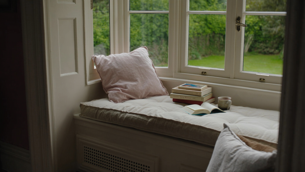
The window itself changes everything. Old single-pane glass has a greenish cast that warms the light slightly; modern low-E glass can amplify the blue, making the room feel even colder. You can’t change the glass, but you can change what frames it.
A north-facing sash window painted in a deep, warm tone, think dark bronze, charcoal, or a rich olive, does something remarkable: it frames the view and stops the eye from drifting to the grey outside. The dark frame becomes a boundary, a deliberate edge that holds the room together. Suddenly, the window isn’t a hole letting in cold light; it’s a picture frame, and the view is a painting.
The quiet truth: you don’t need to replace the window. You need to paint it something that holds its own against the sky.
One room, two walls, a different logic
Here’s the trick that changes everything: paint the back wall, the one opposite the window, a shade darker than the side walls. In a north-facing room, the eye naturally falls back into the window’s cool light, which makes the room feel shallow and exposed. A darker back wall pulls the eye into the room, creating depth and intimacy.
I saw this done in a north-facing study: the side walls in a warm pale stone, the back wall in a deep slate. The result wasn’t cave-like; it was cosy, like a library at dusk. The confidence to go darker on that one wall transformed the room from a corridor of grey light into a room with a destination, a place to sit, to read, to think.
The difference is confidence. Most people are afraid of dark walls in north-facing rooms, but the opposite is true: a dark wall at the far end of the room anchors the space and makes the light that does arrive feel precious, not punishing.
The ceiling is the fifth wall
North-facing rooms often have a low, grey ceiling that feels oppressive, like a lid pressing down on the room. The fix is a whisper of warmth: a blush, a warm white, or even the faintest peach. You don’t see it as colour, you feel it as lift.
The ceiling acts as a reflector. Even a faint warmth up there bounces down, softening the blue light on the walls and warming the air of the room. It’s the difference between a room that feels like a north-facing room, and a room that happens to face north. One is a problem; the other is a character trait.
Paint the ceiling, and the room stops apologising for its orientation. It becomes what it always should have been: a space that feels deliberate, warm, and entirely at home with the light it has.