The shift from novelty to nuance
There’s a moment, usually around mid-March, when the homeware aisles bloom with plastic eggs, neon-pink cushions, and everything that glitters like a child’s birthday party. It’s cheerful, certainly, but it’s also disposable, the kind of decoration you pack away on Easter Monday with a faint sense of relief. What if, instead, your home could feel quietly celebratory all spring long, without looking like a confectionery shop window?
That’s the shift we’re after here. The typical Easter pastel palette, chalky, candy-coloured, aggressively sweet, can be replaced with something far more grown-up: muted clay tones, dusty rose, sage, and buttercream. These colours lift a room without colonising it. They work for a dinner party, a Monday morning, and a lazy Easter Sunday equally. The secret? Nuance. A soft pink that reads as sophisticated rather than saccharine is a matter of tone, texture, and, most importantly, light.
Let your windows set the tone, not the table
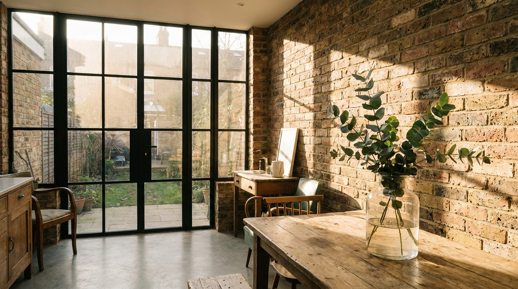
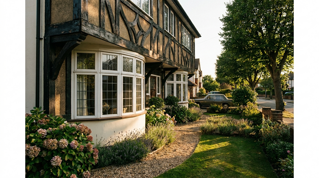
Before you reach for a paintbrush or a cushion, look at your windows. The light that falls through a Victorian sash or a French door determines whether a pastel feels refined or cloying. A south-facing window bathes everything in warm, golden light that softens even the boldest pink, making it feel lived-in and grown-up. A north-facing room, by contrast, can turn a delicate lavender into a flat, cold grey.
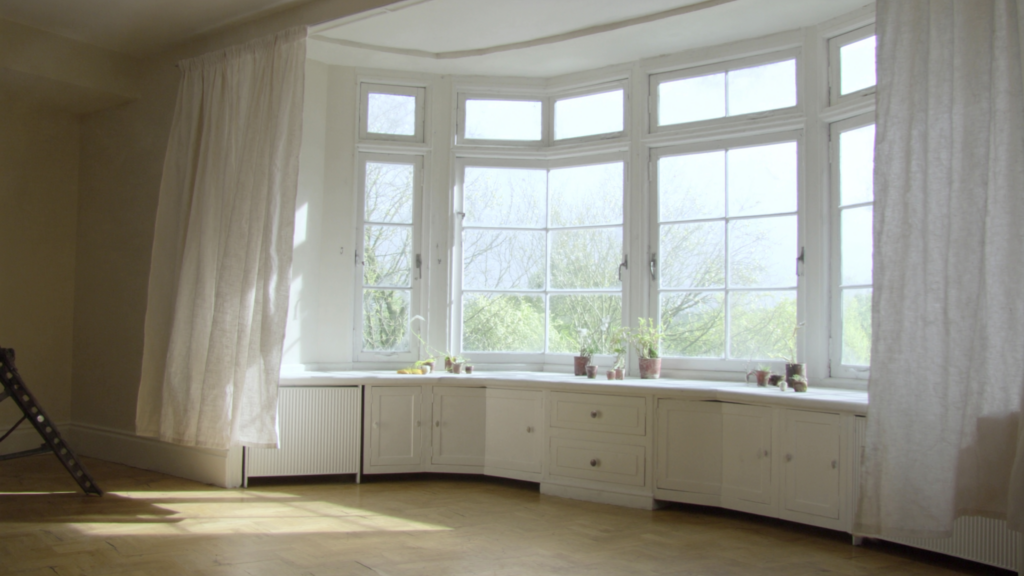
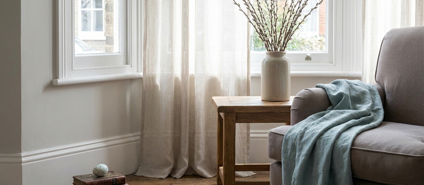
Start with the frame itself. A neutral colour, off-white, pale slate, or a very soft warm grey, keeps the window as the anchor, not the table centrepiece. Then add sheer curtains in a dusty pastel: a faded rose, a pale blue-grey. The fabric filters the light, casting a gentle wash across the room that changes hour by hour. The window becomes the source of the scheme, not an afterthought.
Pick a colour that softens with the seasons
Rather than a single Easter-egg shade, choose one hero pastel that shifts in character as spring progresses. A muted lilac, for example, can look silver-grey in the cool light of early March and warm to a soft lavender by May. That adaptability is what keeps a scheme from feeling stuck in a single weekend.
Testing is everything. Paint a large square on a piece of card and move it around your room at different times of day: morning in the east-facing window, afternoon in the west-facing one. Watch how the colour changes. A clay blush that glows at noon can turn muddy by dusk. A pale ochre that feels sunny in the kitchen might feel sickly in a north-facing bedroom.
Here’s a short palette of four adult pastels that work with white woodwork and aged brass hardware:
- Clay blush, warm, earthy, almost terracotta in shadow
- Sage, green enough to feel natural, grey enough to stay calm
- Pale ochre, like dried straw in sunlight
- Greyed lavender, sophisticated, never sweet
Texture matters more than colour
A room can have the perfect pastel on the walls and still fall flat if everything is smooth and matte. Texture is what stops a scheme from feeling like a nursery. Introduce linen, brushed cotton, matte ceramic, and raw wood, materials that catch the light and add depth.
Think of a linen throw in faded rose draped over a charcoal sofa. A ceramic vase in unglazed terracotta holding a few stems of eucalyptus. A wool rug in a heathered sage that feels soft underfoot. Each piece adds a layer of interest without shouting for attention.
Windows are the perfect place to apply this principle. A nubby Roman blind in pale sage adds texture without competing with the view or the frame. The fabric’s weave catches the light differently throughout the day, so the blind feels alive, not static.
Seven ways to soften a tall sash window for spring
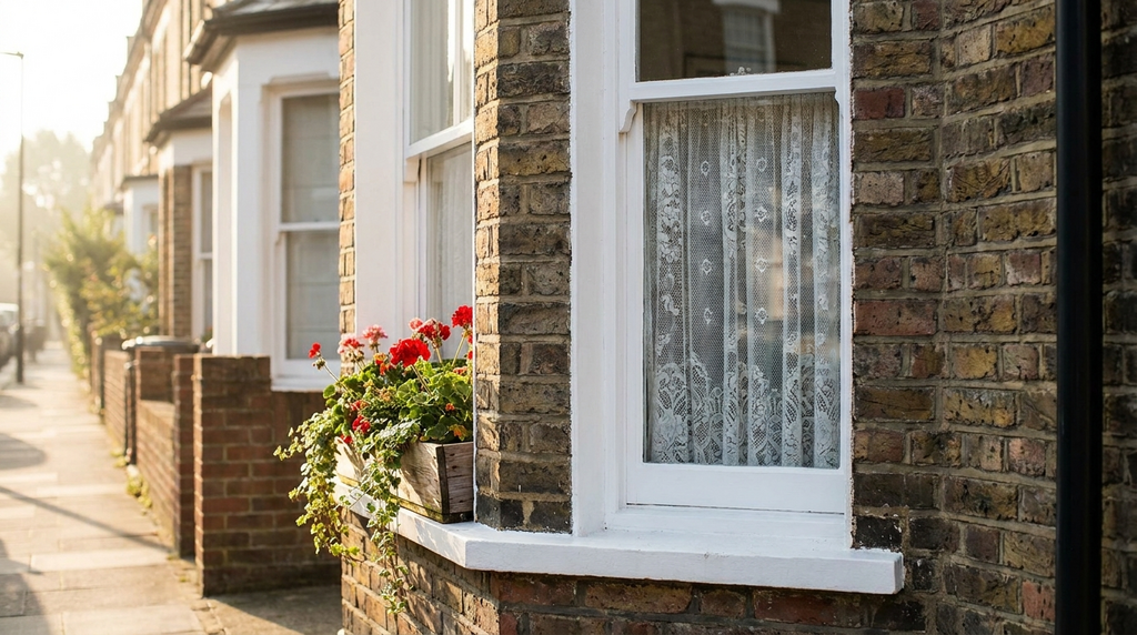
A tall sash window is a natural focal point, especially in spring when you want the outdoors to feel connected to the indoors. Here are seven quiet ways to dress it for the season:
- Line the sill with ceramic eggs. Small, matte, muted pastels, not plastic, not shiny. A quiet nod to Easter that doesn’t demand attention.
- Hang a single sheer panel. Not symmetrical curtains, just one side draped loosely in dusty pink or pale blue. Asymmetry feels intentional and modern.
- Place a low vase of dried eucalyptus or pale tulips on the sill. The vertical stems echo the lines of the sash, drawing the eye upward.
- Swap heavy winter curtains for a linen Roman blind. Choose a warm off-white with a pastel trim, just a whisper of colour at the edge.
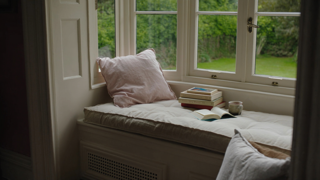
- Add a single pastel cushion to a window seat. Keep the rest of the seat neutral. One hit of colour is enough.
- Paint the window frame itself. A very soft blue-grey that reads as white from a distance, it catches the light without competing with the view.
- Hang a small pastel-toned artwork or print beside the window. At eye level, not on the sill. It draws the eye up and balances the vertical line of the sash.
Bring the pastel outside in, but keep it grounded
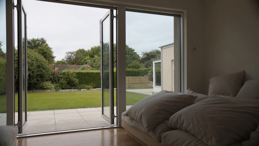
The view through your window is part of your interior scheme, whether you plan it or not. A pot of pale hyacinths on the sill, or a painted garden chair visible through the glass, extends the pastel palette beyond the room itself. But here’s the trick: don’t match the interior pastel to the exterior flower colour. Let them complement instead. A sage interior looks even better with white tulips outside; a clay blush wall sings next to grey-green foliage.
The window itself is the frame for this outdoor pastel. Keep the glazing clean, the frame neutral, and let nature do the decorating. The result is a scheme that feels effortless, not overthought.
The one rule that keeps pastels adult
There is a single principle that separates a grown-up pastel scheme from a nursery: every pastel must be paired with something grounded. A dark wood floor. A black metal lamp. A raw linen sofa. A concrete planter. Without this anchor, pastels drift into saccharine territory; with it, they become calm, intentional, and seasonally appropriate.
Picture this: a pale pink cushion on a charcoal sofa, seen through a clean window with spring light falling across the floor. The room feels like Easter, lifted, soft, quietly celebratory, without shouting about it. That’s the difference between decoration and design.