A welcome that reads differently after dark
You pull into the drive on a late November evening. The house is a dark block against the sky, and the path from the car to the front door has vanished entirely. You fumble for keys, one hand outstretched, trying to remember where the step dips and where the lavender bush has grown fat. That moment, the one where your own home feels slightly hostile, slightly farther away than it is, is the one good path lighting is built to erase.
The old solution was a floodlight on the garage wall: a blast of white that turned the entire facade flat, washed out the brick, and left you squinting in your own doorway. It worked, technically, but it made the house look like a loading bay. The better approach is something softer, lower, and far more deliberate, light that draws the eye along a route rather than blasting the whole scene into submission. Good path lighting changes how a house feels at night, turning a functional route from the gate to the door into a quiet invitation. It is, in its way, the most generous thing you can do for a building after dark.
Let the path lead the eye, not the feet
There is a difference between lighting for safety and lighting for atmosphere, and the two are not always friends. A bright, even strip of light along a path tells your feet exactly where to go, but it tells your eyes nothing at all. It flattens the journey. The best path lighting is deliberately uneven, low-level, suggestive, a rhythm of soft pools rather than a single corridor of glare.
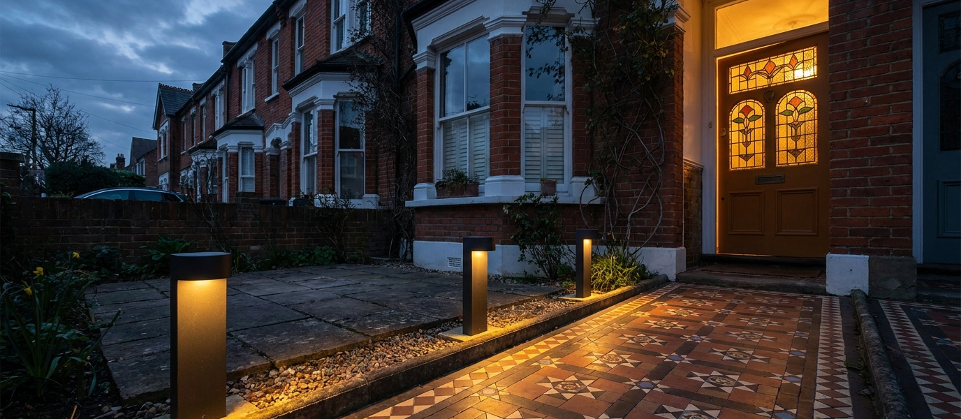
A staggered line of bollards or mushroom lights, set at intervals that feel irregular but are carefully measured, creates a sense of journey. The eye moves from one soft glow to the next, and the house at the end of the path feels larger, more generous, as though it has unrolled a carpet of light just for you. Recessed step lights, set into the risers of a shallow stair, do the same thing: they guide without announcing. The psychological effect is subtle but real, a path that curves gently away from the front door, lit in this way, makes the house feel like it has depth, like it is holding something back for you to discover.
Eight ways to soften a tall sash window with path lighting
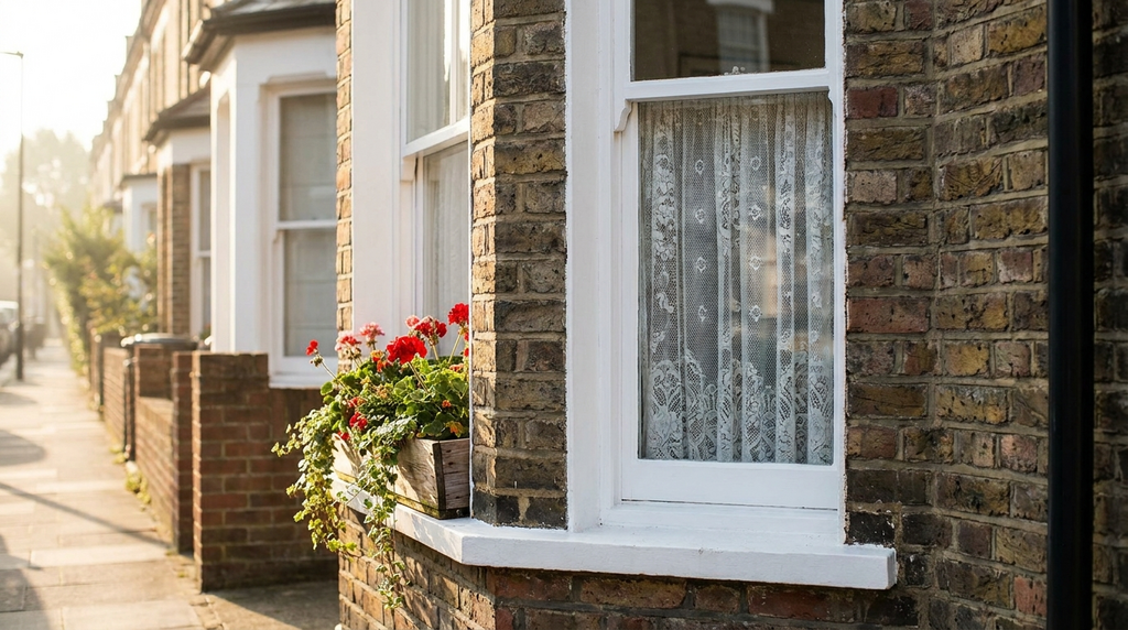
If your house has tall sash windows, that lovely Victorian or Georgian verticality, path lighting can either celebrate them or fight them. Here are eight ways to make sure it is the former.
- Uplighters at the base of the window frame. A low bollard or ground-recessed uplighter placed at the foot of the window casts shadows upward, emphasising the height of the sash and drawing the eye to the proportions of the facade.
- Cross-lighting from two low bollards at 45 degrees. One light from either side, aimed across the window, avoids the interrogation-room look of a single flood. It models the brickwork and gives the window a gentle presence.
- Warm white only. Stick to 2700K or lower. Cool blue-white light makes red brick look grey and renders timber flat and lifeless. Warm light makes everything feel like evening.
- Mirror the window’s rhythm. If you have a two-over-two sash, pair two path lights in line with the mullions. The light repeats the architecture, rather than fighting it.
- Avoid lighting the glass itself. A soft glow on the sill or the frame is far more flattering than a lit interior view. You want the window to feel like an object, not a peep show.
- One carefully placed lantern on a low post. Not a full row. Just one, anchoring the corner of the window bay. It gives the eye a place to rest.
- Layer with a dimmable wall washer above the window. A soft wash of light on the brickwork above the sash creates depth without glare, and makes the window feel set into the wall rather than pasted onto it.
- Test with a torch before you commit. Walk the path at night, torch in hand, and see where shadows fall naturally. Move the beam around. That ten-minute test will tell you more than any lighting plan ever will.
For more on choosing the right finish for your fixtures, see door colour ideas, the same principles of warmth and contrast apply.
Pick a colour that softens with the seasons
The fixture itself matters almost as much as the light it casts. A path light in patinated bronze or weathered black absorbs light rather than reflecting it, which prevents the kind of harsh glare that makes a garden feel like a car park. Verdigris finishes, that soft blue-green that copper turns over time, do the same thing, and they catch the light in a way that feels almost organic.
Against a pale gravel path, a dark fixture creates a clean silhouette, a crisp note against the scatter of stone. Against dark earth or mulch, a light fixture disappears until the lamp comes on, at which point it glows like a small, contained moon. The seasonal shift is part of the pleasure: in autumn, leaves gather around dark bases and catch the glow, turning the path into a mosaic of amber and shadow; in winter, frost makes the same fixture look crystalline, as though the light itself has frozen mid-air.
Why texture matters more than colour
The surface the light falls on is as important as the light source, and it is a detail most people overlook until they see the difference side by side. Rough stone, gravel, or brick scatter light softly, breaking it into a thousand tiny highlights that make the path feel alive. Smooth concrete or tarmac, by contrast, bounce the light back in a single flat sheet, and the path reads as a strip of nothing.
A path lined with cobbles or setts creates a natural texture that path lighting amplifies. Each stone catches the glow from a slightly different angle, and the result is a surface that feels rich and varied underfoot. A poured slab path, even with the same lights, reads as a single flat ribbon. The tactile quality matters: good path lighting does not just show you where to walk, it makes the ground feel inviting underfoot, as though the house itself has laid out a welcome mat of light and stone.
Let your front door do the heavy lifting
The final step, the transition from path light to door light, should feel like a crescendo, not a separate system. A single pendant or lantern above the door should echo the warmth and height of the path lights, not overpower them with a different colour temperature or a more aggressive beam. If the path lights are warm and low, the door light should be warm and slightly higher, a natural progression, like a sentence that builds toward its full stop.
The trick is that the door light should be the brightest element, but only just. If it blazes, the path lights look weak and the whole approach feels anticlimactic. If it is too dim, the door recedes and the path feels like it leads nowhere. A separate switch for the path lights gives you the option for drama: dim the path as you reach the door, and let the lantern do the final welcome alone. It is a small gesture, but it changes the entire experience of arriving home.
For more on how window proportions affect the feel of a facade, see sash window restoration tips and front door paint colours.