A front door that feels settled
You know the feeling. You’re standing on the pavement, keys in hand, and something about the front of the house nags at you. The door is fine. The porch is fine. But your eye lands on the door, then skips to an empty space beside it, then back to the door again, like a tongue worrying a loose tooth. You’ve felt this without ever naming it, that subtle, almost imperceptible discomfort of an entrance that hasn’t quite decided what it wants to be.
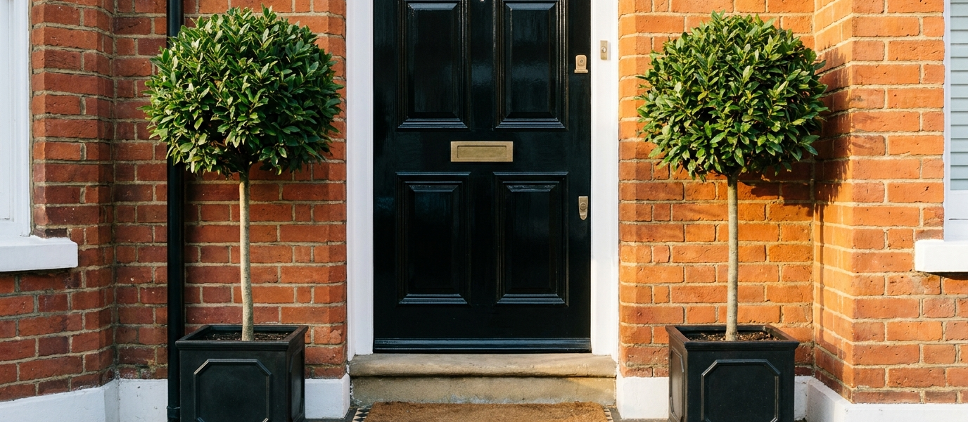
Symmetry isn’t about formality. It’s about the brain relaxing. When a front door is flanked by matching sidelights or identical planters, the house reads as though it arrived whole, not assembled from whatever the previous owner had left over. A balanced entrance makes every visitor (and you, every time you come home) feel a quiet, unearned calm before they’ve even stepped inside. It’s the architectural equivalent of a deep breath.
What symmetry does that nothing else can
Our eyes are lazy in the most elegant way. They crave mirrored lines the way a cat craves a square of sun. A door flanked by matching windows or identical lanterns signals order without effort, the brain doesn’t have to work to make sense of it. It just feels right.
Contrast this with the kind of “quirky” asymmetry that often looks accidental rather than curated. A single pot on one side, a different style of house number on the other, it doesn’t read as personality; it reads as unfinished. Symmetry needs no explanation. It works on a Victorian terrace, a 1930s semi, and a new-build box alike. The principle is older than any trend, and it will outlast them all.
Let your door do the heavy lifting
The front door is the anchor. Choose a colour that holds the centre, a deep navy like Farrow & Ball’s Hague Blue, a rich oxblood that glows in low light, or a soft charcoal that recedes just enough to let the architecture speak. Then let the surrounding elements echo, not compete.
A bold door works best when the glazing beside it is restrained. Clear or lightly frosted glass keeps the focus on the door’s mass and colour, rather than splintering attention across competing details. A statement door in a symmetrical frame feels twice as confident as one in an unbalanced setting. It knows its job, and it does it without apology.
The quiet power of matching side panels
Sidelights are the unsung heroes of symmetrical entry styling. When they mirror each other exactly, same width, same glazing pattern, same finish, the door becomes part of a composition, not a lone object floating in a wall of brick. They give the entrance a frame, like a painting.
For a townhouse, slim vertical panels keep the proportions elegant and upright. For a detached home, wider sidelights create a more generous, welcoming spread. The exact style matters less than the mirror effect itself. Simple Georgian bars or clear sheets of glass both work, as long as they reinforce the symmetry without shouting about it. The eye registers the balance before the brain has time to analyse it.
Pick a colour that softens with the seasons
A symmetrical entrance can handle a changeable palette. A dusty sage like Little Greene’s Sage Green looks different in spring light than in autumn dusk, and the balance holds regardless. A warm terracotta shifts from clay to copper as the day fades, and the mirroring keeps it grounded.
What doesn’t work is colour that fights the architecture. Bright primaries, a fire-engine red, a screaming yellow, can unbalance even a perfect mirror layout, because the colour itself demands so much attention that the symmetry feels irrelevant. Muted, natural tones let the symmetry breathe. And the door colour should relate to the window frames or the brickwork, so the whole frontage feels considered, not just the door.
Why texture matters more than colour
Symmetry can feel flat if every surface is smooth. The trick is to introduce texture, the door’s timber grain, the matte finish of the sidelight frames, a hammered metal letter plate that catches the light differently at different times of day. These small variations keep the eye moving without breaking the mirror.
Tactile materials for the threshold and surrounds, a stone step, brick edging, painted wood, create a rhythm the eye can follow from pavement to door handle. Texture keeps a symmetrical design from looking like a showroom display. It makes the entrance feel lived in and warm, as if the house has been there long enough to settle into its own skin.
Eight ways to soften a tall sash window
A tall sash window beside the door can feel imposing. Here’s how to bring it back into proportion:
- Hang a single pendant light at eye level to break the vertical line.
- Place a low, wide planter on each side of the door to anchor the composition horizontally.
- Use a chunky doormat that mirrors the door’s width, not its height.
- Install a fanlight with a simple radial pattern to draw the eye outward.
- Choose a door with horizontal panels to counter the window’s upward thrust.
- Add a slim bench on one side, but balance it with a tall lantern on the other.
- Paint the window frame the same colour as the door for a unified block of tone.
- Let the glass remain clear so the symmetry reads from inside the house too, especially at night when the hall light is on.
The one thing that undoes it all
A single mismatched detail, a different style of house number, an off-centre light, a plant pot that doesn’t match its twin, breaks the spell entirely. The brain notices the gap before it notices the beauty.
Stand on the pavement and scan your entrance like a stranger would. Look for anything that pulls the eye sideways: a lantern that leans left, a letterbox that sits higher on one side, a doormat that’s six inches too narrow. The fix is often small and cheap, a new house number plate, a matching pot from the garden centre, a light moved six inches to the right.
Symmetrical front door styling isn’t about perfection. It’s about giving the house a face that feels finished. The kind of face that, every time you turn the key, makes you think: Yes. This is it.