The light catches the edge first
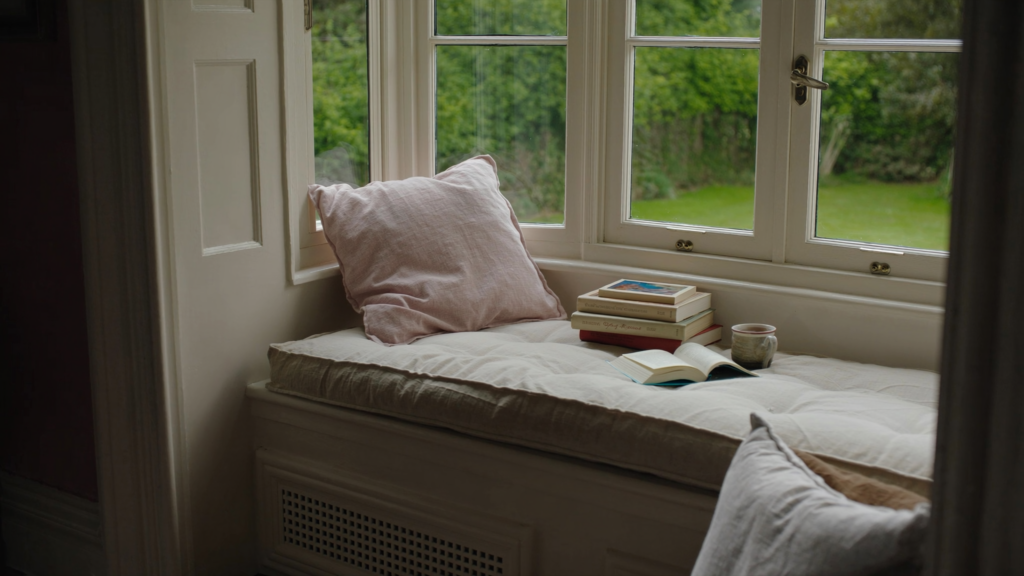
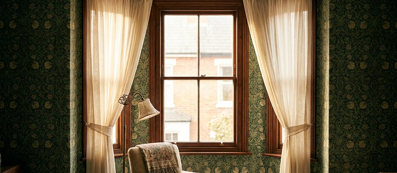
It’s that quiet hour just before noon, low winter sun slanting through a Victorian sash. Your eye drifts to the wall beside it, where the wallpaper meets the frame. And there it is, either a perfect, crisp seam that feels intentional, or the faintest curl at the edge, a tiny betrayal you didn’t notice until the light caught it just so. That moment separates the rooms that feel finished from the ones that feel slightly off.
There’s a real tension here. You want the warmth and personality that pattern brings, especially around a window where the light plays across it all day. But you also know the practical fears: heat from the radiator below, condensation on cold mornings, the dreaded bubbling at the sill that turns a weekend project into a peeling disappointment. This piece is about getting the romance of wallpaper around windows without the regret, what to look for, where to stop, and how to finish so the edge stays sharp for years.
Choose your paper like you choose a coat
Not all wallpapers are built for window walls. A south-facing sash will hammer cheaper inks with UV light, and within a single season you’ll see fading along the edge where the sun hits hardest. For those rooms, look for papers labelled lightfast, or stick to vinyl and washable options that resist both sun and moisture. Kitchen and bathroom windows need something tougher: a good-quality vinyl or a coated paper that can handle steam without lifting.
There’s also the question of how you hang it. Paste-the-wall papers are a genuine advantage around windows because you control the moisture on the sheet itself. The paper expands less at the frame, and you don’t get that annoying contraction as it dries that pulls the edge away from the woodwork. Paste-the-paper can work, but you’ll need to be more careful about soaking times and trimming. One wrong choice near a window, a cheap non-woven in a steamy bathroom, or a delicate hand-print on a south-facing wall, and you’ll be patching within six months.
The reveal trick that saves every seam
The secret that professional decorators use is deceptively simple: cut and wrap. Instead of butting the paper up to the window frame and hoping the edge stays hidden, you cut the paper to wrap into the reveal, the recess between the wall and the frame itself. This means the raw edge is tucked into the shadow line where the wall meets the wood, invisible to the eye and protected from knocks.
You’ll need a sharp Stanley knife, a straightedge, and a plastic smoother to press the paper into that angle. Work slowly: cut the paper about 15mm wider than the reveal depth, then press it into the recess with the smoother. Trim the excess with a fresh blade, cutting against the frame edge. The payoff is a finished look that feels intentional rather than compromised, no visible raw edge, no peeling at the corner, and a seam that stays sharp even as the seasons change.
Let the window dictate the pattern
Tall sash windows have a natural vertical rhythm that certain patterns amplify beautifully. A vertical stripe or a climbing botanical that runs with the height draws the eye up and makes the window feel taller, lifting the whole ceiling with it. For wide casements or bay windows, the opposite applies: small-scale geometrics or ditsy florals work better than oversized motifs that get lost or cut awkwardly at the frame.
Six patterns that play well with window frames:
- Grasscloth-look textures, forgiving of imperfect walls, and the subtle weave catches light without competing with the view
- Ticking stripes, narrow, regular, and endlessly reliable around frames
- Miniature botanicals, small leaves or sprigs that repeat every 20-30cm, so the pattern never gets truncated awkwardly
- Tone-on-tone damasks, enough pattern to feel rich, but the same colour family means the frame doesn’t fight the design
- Narrow chevrons, the angles add movement without overwhelming a small window wall
- Hand-blocked repeats under 30cm, the small repeat means you waste less paper matching patterns at the frame
Where to stop (and where to start)
You don’t have to paper the whole wall. In fact, some of the best rooms use wallpaper selectively around windows, letting the window wall itself breathe as a neutral backdrop. This is especially effective in rooms with multiple windows or uneven spacing, where papering every wall can feel busy or highlight awkward gaps.
The chimney breast or alcove walls are natural candidates for pattern, while the window wall stays painted in a colour pulled from the paper. There’s also the “picture frame” approach: paper inside a border or panel around the window, creating a feature that frames the view rather than competing with it. This works beautifully in a dining room or hallway where you want the window to feel like a painting.
The sill is the trouble spot, here’s how to fix it
Window sills are where wallpaper goes to die. Condensation collects there on cold mornings, heat rises from radiators below, and the combination creates a perfect environment for bubbling, peeling, and lifting. The common mistake is running the paper right down to the sill and hoping for the best.
The practical solution is to stop the paper about 5mm above the sill and seal the gap with a paintable silicone or a thin wooden bead. That tiny buffer zone prevents moisture from wicking up into the paper, and the silicone or bead gives you a clean, paintable edge that won’t lift. Alternatively, use a coordinating paint colour on the sill and the frame, then paper only the wall above. The paint acts as a buffer zone against moisture and wear, and it actually looks more intentional, like the window is framed in its own colour.
Light changes everything, test before you commit
Wallpaper around windows is the most light-exposed surface in the room, and the colour shift between morning, midday, and evening can make or break the whole scheme. What looks like a soft grey in the shop can read as cold blue in north light, or wash out to nothing in a south-facing room. A rich ochre that feels warm at dusk can feel overwhelming at noon.
Hang a sample, or a full drop if you can, and observe it at three times: the clear morning light, the harsh midday glare, and the dim evening lamplight. Move around the room and see how it changes as the sun moves across the window. This is the single most important step you can take, and it’s the one most people skip. The paper that looks perfect in the shop aisle might look completely different on your wall, and the light from a window is merciless about revealing that difference.
The frame is a border you didn’t plan
Window frames, architraves, and sills aren’t just functional, they’re part of the composition. Paint them a colour pulled from the wallpaper, and the whole wall ties together in a way that feels designed rather than accidental. A sage-green botanical paper with cream frames painted in the same cream as the paper’s background creates a smooth flow. A deep navy paper with charcoal-grey frames makes the window feel like a deliberate dark accent.
The result is that the window becomes part of the pattern rather than an interruption. The wallpaper feels like it belongs there, not like it’s fighting the woodwork. And because the frame is painted in a colour from the paper, even if the paper ever needs replacing, the frame colour will still work with whatever comes next.