Your front door has been waiting for an introduction
There’s a small, grinding frustration that comes with an anonymous frontage. The delivery driver circles the block, phone pressed to ear. The taxi idles at number 47 while you stand at number 43, waving. Your home presents a blank face to the street, polite, yes, but forgettable. What you’re really longing for is a facade that feels intentional, not accidental. A house that looks like it knows exactly who it is before anyone rings the bell.
That’s where house numbers and signs come in. They’re the punctuation your home needs, the full stop, the exclamation, the quiet comma that says this one. Because the first thing anyone reads about your house is its name or number, and that reading sets the tone for everything behind the door. Get it right, and a tired facade suddenly looks like it has opinions. Good ones.
Let your front door do the heavy lifting
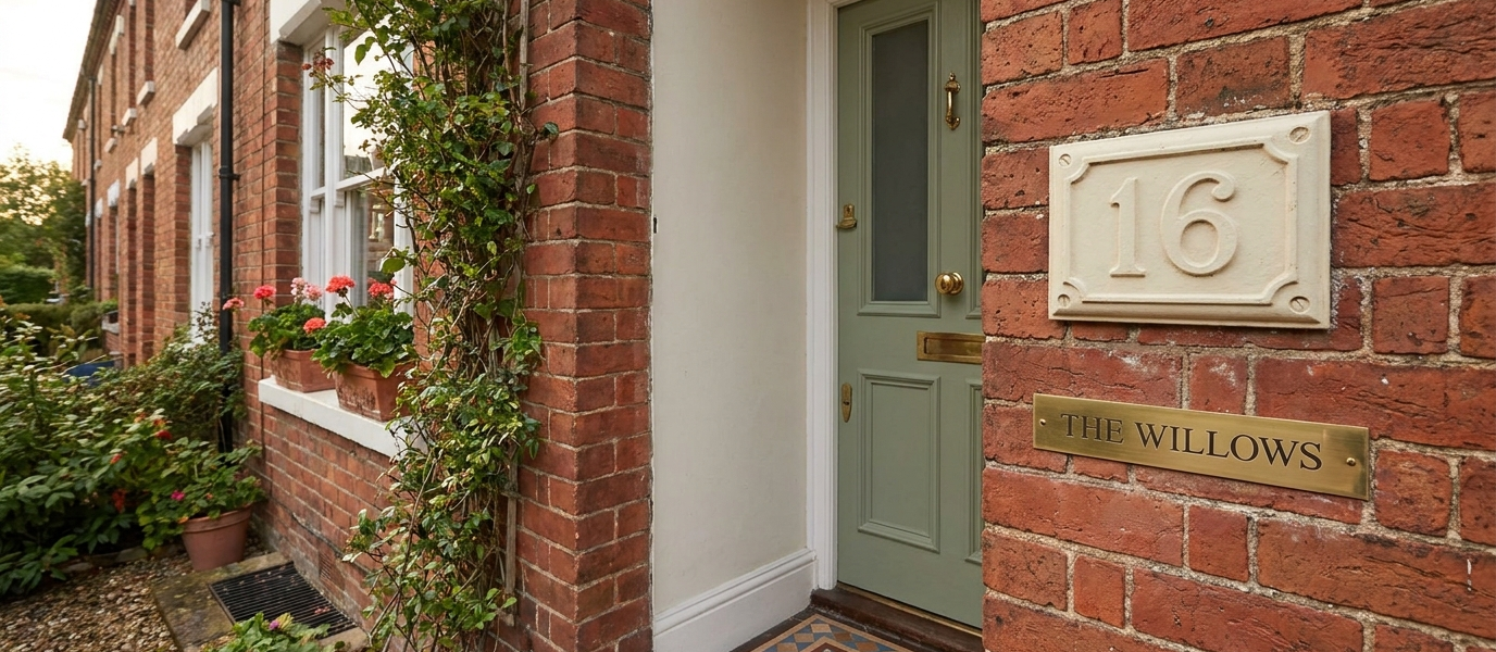
Think of your front door as the canvas, the number or sign as the signature. A polished brass numeral against a deep Farrow & Ball Railings blue reads as deliberate, not default. Black iron on pale oak does the same trick in a different key. The contrast is what makes the door feel like a decision, not an accident.
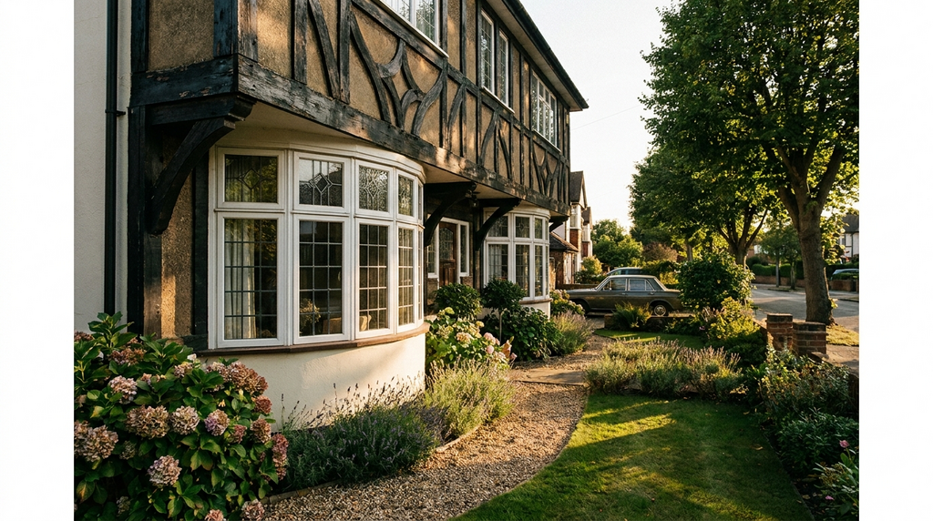
That single, well-placed element can pull a tired Victorian terrace or a 1930s suntrap bay into focus. It’s the design equivalent of a good jacket: it doesn’t do all the work, but it makes everything else look better. If your front door is already a statement, a deep Setting Plaster pink, a rich sage green, let the number sit quietly in a brushed steel or aged bronze. If the door is understated, let the sign sing.
Pick a material that weathers beautifully, not badly
One British winter is all it takes to separate the good materials from the impostors. Cast iron develops a soft, honest patina over time, it doesn’t peel, it settles. Bronze does the same, shifting from bright to a muted, almost leathery warmth. Stainless steel stays crisp without rusting, and stone, slate, limestone, a carved granite plaque, only looks better after rain has darkened its surface.
The difference between something that looks settled and something that looks neglected comes down to this: choose a material that gains character, not damage. Avoid painted MDF, thin aluminium, or anything with a lacquer that promises permanence but flakes by February. For coastal homes, marine-grade stainless or solid bronze are worth the extra, salt air is brutal on pretenders. For a Victorian sash in a city terrace, cast iron with a wax finish will outlive the rest of the street.
Scale is the detail most people get wrong
Here’s the rule that almost everyone ignores: hold the number at arm’s length from where it will sit. If it looks small there, double the size. Numbers that shrink into the doorframe or, worse, overwhelm a narrow pilaster, both miss the mark. The right proportion depends on the door, the porch, the street, but it’s almost always larger than you think.
A well-scaled sign doesn’t shout. It simply announces, with the quiet authority of something that was measured twice and fitted once. On a tall Victorian sash, a single 15cm numeral on the transom sits comfortably. On a wide 1930s door, two digits of 20cm each feel grounded. The mistake is to make the sign match the door’s width; better to match the door’s rhythm, the spacing of the panels, the height of the letterbox, the line of the architrave.
Eight ways to soften a tall sash window
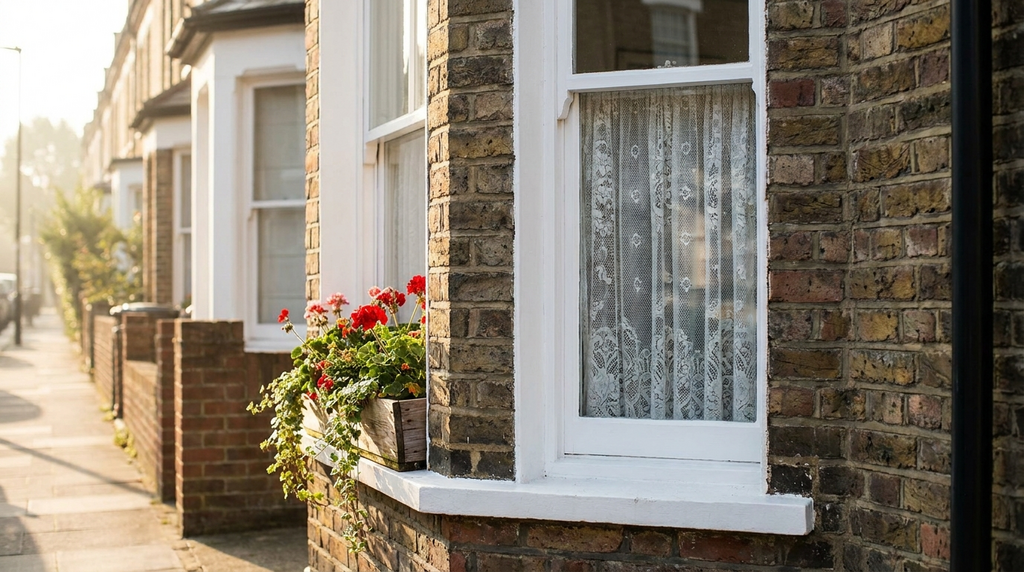
If your house number sits beside a tall sash window, the window can either frame it or fight it. Here are small interventions that let the number stay the focal point without the window feeling ignored:
- Wrought-iron bracket, mount the number on a simple scroll bracket fixed to the brickwork beside the window. It lifts the numeral into its own territory.
- Painted sill box, a shallow wooden box painted the same colour as the window frame creates a shelf for a single numeral or small plaque.
- Climbing plant trained to one side, a jasmine or ivy trained up one side of the window draws the eye past the number, not over it.
- Shallow window box, keep it low and tight to the sill; the number sits above, not behind, the foliage.
- Painted arch detail, a soft painted arch above the window (think Farrow & Ball Drop Cloth) frames both window and number together.
- Hanging lantern, a small lantern hung to one side lights the number at night without competing for attention.
- Timber lintel accent, a painted timber lintel above the window echoes the material of the sign, pulling the two into conversation.
- Side-mounted plaque, fix a vertical plaque to the reveal, just inside the window frame. It reads clearly from the pavement without interrupting the glass.
Each of these keeps the number as the star. The window becomes the supporting cast, not the distraction.
Why texture matters more than colour
Colour fades. Trends shift. The dusty rose that felt daring in 2023 looks tired by 2028. But texture, the grain of oak, the granular surface of cast iron, the cool matte of slate, stays interesting. It doesn’t rely on fashion. It relies on how it catches light.
A textured surface catches morning light differently from a flat painted one. The low winter sun rakes across a carved numeral and throws a shadow that changes by the hour. There’s a quiet pleasure in running a finger over a raised number, a tactile reminder that someone took care. That’s what separates a house that looks loved from one that just looks decorated.
Make it readable from the pavement, not just the doorstep
The practical kindness of a well-placed sign is that it works for everyone: the postman, the guest arriving after dark, the emergency service driver who needs to find you fast. That means contrast, a dark sign on a light wall, or a light sign on a dark door, and kerning that doesn’t compress the digits into a single blurry shape.
A number that reads at night is one that doesn’t disappear into shadow. A small warm LED, a lantern, or a downlight from a porch ceiling can do the job without turning your facade into a car park. The goal is atmosphere, not security lighting. A soft glow that picks out the numerals without flooding the street.
Let the sign echo something already there
The best house numbers and signs don’t arrive as strangers. They feel like they were always meant to be there, because they pick up something already present. The curve of the architrave, the thickness of the door frame, the font of an old map that named the house a century ago. A number that echoes the arch of a fanlight or the line of a pediment reads as coherent, not coincidental.
That quiet satisfaction, the sense that the sign belongs, is the mark of a facade that knows exactly who it is. It doesn’t announce itself with a shout. It simply stands there, legible and assured, and lets the rest of the street catch up.