The gap that changed how a room feels
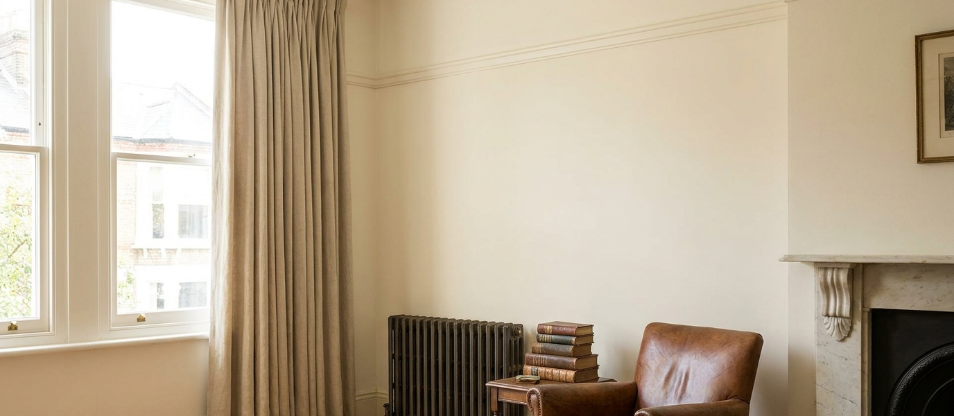
You know the look. That awkward, dark bunch of fabric sitting right above your picture rail, creating a heavy, shadowy line that cuts across the wall like a permanent frown. The curtain header, that gathered, pleated, or ruffled top, ends up exactly where your eye wants to travel smoothly from the rail to the ceiling. Instead of a clean, uninterrupted plane, you get a visual roadblock. The wall feels shorter, the window feels cramped, and the whole room seems to sigh under the weight of it.
What you really want is for the picture rail to be the star, a crisp, deliberate line that frames the room. You want to stop seeing the hardware and start seeing the space breathe. The good news? You don’t need to rip out the rail or abandon curtains altogether. You just need to rethink what happens above the window.
Why the header matters more than the drop
Most curtain problems start at the top, not the bottom. The drop, how the fabric falls to the floor, is what everyone notices first, but the header is what sets the tone. And when you have a picture rail, that tone is especially delicate. The rail creates a natural break in the wall, a horizontal line that your eye follows around the room. A standard curtain header, say, a pencil pleat or a deep gathered valance, sits right at that break, competing with it. Suddenly, the rail looks like an afterthought, and the curtain looks like it’s fighting for attention.
The principle is simple: the header should disappear into the rail’s shadow, not compete with it. Think of the rail as a shelf for the fabric to rest against, not a hurdle to clear. When the header is low-profile, the rail remains the visual boundary between wall and window, and the curtain becomes a soft, fluid extension of that line.
Three header styles that vanish behind the rail
Not all headers are created equal. Some are built to be seen; others are built to be forgotten. Here are three styles that let the picture rail do its job:
- Pinch pleat with a low-profile track. The pleats sit just below the rail, not above it. Choose a slim ceiling-mounted track that runs parallel to the rail, and the pleats will hang like tidy columns, barely disturbing the rail’s line.
- Ripplefold on a slim ceiling-mounted track. This style uses a continuous wave of fabric that absorbs the header entirely. The soft, even curves start right at the track, so there’s no bulky top to speak of. It’s almost like the curtain emerges from the rail itself.
- Tab-top with a hidden rod. Fabric tabs loop over a rod tucked behind the rail’s lip. The rod is invisible from the room, and the tabs are so low-profile they barely register. The curtain looks like it’s suspended from the rail by magic.
Each of these styles keeps the rail as the visual anchor. The curtain becomes the supporting actor, not the lead.
The bracket trick that saves six inches of wall
Here’s a clever fix that most people don’t know about. Instead of mounting your curtain hardware above the picture rail, which eats up precious wall space and creates that awkward gap, mount it directly on the rail. You need a low-profile rail bracket that clamps onto the rail’s top edge. These brackets are built to hold a curtain rod at the same height as the rail, so the rod sits flush against it.
The result? You reclaim those six inches of wall between the rail and the ceiling. No more dark, empty space above the rail. No more awkward bracket placement. The curtain rod becomes part of the rail’s line, and the curtain header hangs directly below it. It’s a small change that transforms the whole room’s proportions.
Let your front door do the heavy lifting
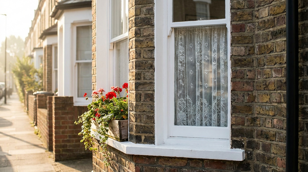
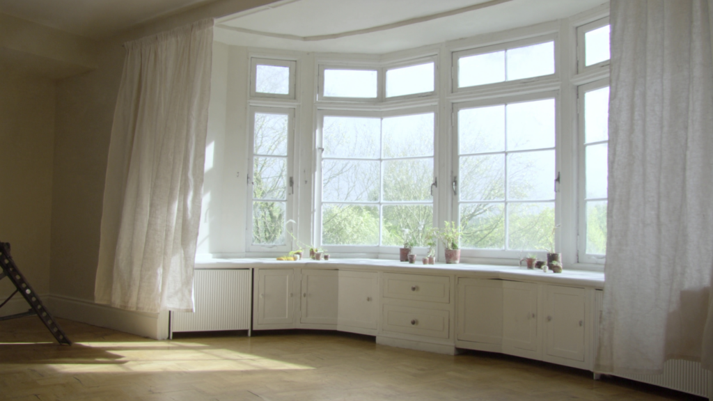
The same principle applies to a front-facing sash window. The picture rail frames the window, and the curtain header should not interrupt that frame. For a bay window with a rail, choose a single curtain track that follows the bay’s curve, with headers that sit flush against the rail’s underside. The rail becomes the anchor; the curtains are just soft fabric falling from it.
This works especially well in a Victorian or Edwardian home, where the picture rail is often original. The rail’s natural wood or painted finish becomes the only hardware you see. The curtain disappears into the rail’s shadow, and the window feels taller, lighter, and more intentional.
Why texture matters more than colour
When the header is hidden, the curtain’s texture becomes the focal point. Colour is still important, but texture is what gives the fabric life. A heavy velvet header might still bulk above the rail, even if the header is low-profile. A fine linen or silk-blend, on the other hand, drapes more quietly, falling in soft folds that don’t compete with the rail.
The rail itself can be painted to match the wall or left in natural wood. Either way, it’s the texture of the fabric that draws the eye, not the hardware. A wool flannel curtain in a deep charcoal feels different from a crisp cotton in pale cream. The texture tells the story, and the rail frames it.
Eight ways to soften a tall sash window
If you have a tall sash window with a picture rail, here are eight practical ways to make the curtain header disappear:
- Use a single panel of fabric, not two. A single panel creates a cleaner line and avoids the bulk of a centre gap.
- Hang the curtain from a rail that sits on the picture rail, not above it. Use the bracket trick mentioned earlier.
- Choose a header that folds flat against the rail, like a knife pleat. The pleats lie flat and create a crisp, architectural line.
- Add a small pelmet that matches the rail’s width. The pelmet hides the header entirely and reinforces the rail’s horizontal line.
- Use a curtain weight to keep the fabric from flaring at the header. A weighted hem ensures the fabric falls straight and doesn’t puff out.
- Paint the curtain track the same colour as the rail. This makes the track disappear into the rail’s shadow.
- For a period look, use a brass rod that sits just below the rail. The rod becomes a subtle detail, not a dominant feature.
- Avoid bulky linings that create a second header. Choose a lightweight lining that doesn’t add volume at the top.
The one measurement that fixes everything
Here’s the single measurement that will save you from a world of frustration: the distance from the top of the picture rail to the ceiling. If that gap is less than six inches, a standard curtain header will look cramped. The fabric will bunch up, the header will crowd the rail, and the whole arrangement will feel squeezed.
The fix is simple: choose a low-profile header that sits entirely within the rail’s depth. A blind header, where the fabric is gathered into a flat band, works beautifully. Or a simple gathered panel with a narrow rod pocket. The key is that the header doesn’t extend above the rail. It stays within the rail’s shadow, so the rail remains the visual boundary between wall and window. Measure that gap. Then choose your header accordingly. Your room will thank you.