The light that lands on your doorstep
Picture it: a late autumn afternoon, the kind where the sun hangs low and honeyed, catching the gloss of a freshly painted door. You’re standing on the path, brush still tacky, watching the colour shift as clouds roll past. One moment it’s a deep, confident blue; the next, a shadowy slate. It’s the quiet hour before dusk, and the house feels like it’s breathing with you.
But beneath that moment of satisfaction lurks a question you might not have voiced aloud: how do you choose a colour that will still feel like yours in five years? Not this season’s, not the one your neighbour just picked, but something that settles into the brick and the ivy and the changing light until it becomes inseparable from the act of coming home.
Let your front door do the heavy lifting
Your front door is the house’s handshake. It’s the first thing you see when you pull into the drive, the last thing you touch as you lock up for the night. It introduces you to every guest, every delivery driver, every passer-by. That’s a lot of weight for a single panel of wood to carry.
Yet so many of us choose a door colour the way we choose a throw pillow, on a whim, chasing a trend that screams “now” but will whisper “why did I?” by year three. A vivid coral or a sharp chartreuse might photograph beautifully on Instagram, but will it still feel like home when the novelty fades and the paint begins to weather? A lasting front door colour lives comfortably with changing brick, shifting plant life, and the slow patina of years. It doesn’t need to shout to be noticed.
Pick a colour that softens with the seasons
The trick is to test your swatches not just in the midday sun of a June afternoon, but in the grey drizzle of a November morning and the dim, quiet hour just before dawn. Tape a large chip to the door and live with it for a few days. Watch how a deep green like Farrow & Ball’s Green Smoke turns almost black in shadow, then glows emerald when the sun hits it. Notice how a warm grey, think Little Greene’s Lead, holds its composure against autumn leaves and spring blossom alike.
Greens, deep blues, and warm greys age gracefully. They weather, they fade slightly, and they become part of the landscape. A colour that looks crisp in June can feel harsh in December, when the garden is bare and the light is thin. Choose for the whole year, not just the golden hour.
Why texture matters more than colour
Here’s the dinner-table truth that contradicts every paint chart you’ve ever seen: the finish matters more than the hue. A high-gloss door catches every speck of dirt, every fingerprint, every imperfection in the wood beneath. It’s unforgiving. But a satin or eggshell sheen, the kind that feels almost velvety to the touch, absorbs light rather than reflects it, hiding the marks of time with quiet grace.
There’s a tactile pleasure to a well-painted door: the grain of the wood beneath your palm, the smoothness of a careful brushstroke, the slight give of a layered finish. A textured or matte surface doesn’t just look better as it ages; it feels better. It’s the difference between a door that demands constant attention and one that settles into the house like an old friend.
Eight ways to soften a tall sash window
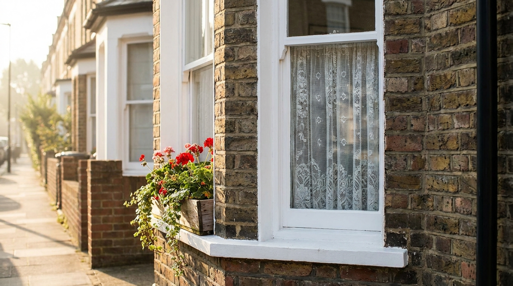
If your door sits beside a tall sash window, you’ve got a design opportunity, and a potential distraction. The window should support the door, not compete with it. Here’s how to make that work:
- Paint the frame a tone lighter than the door, a soft Farrow & Ball Drop Cloth next to a deep Setting Plaster pink keeps the window from stealing the show.
- Add a planted window box in the same colour family, trailing ivy in a muted green pot bridges the gap between door and glass.
- Use a storm door in a neutral, a pale timber or charcoal frame creates a buffer that ties inside to outside without shouting.
- Hang a simple linen blind, it softens the hard lines of the sash and adds a layer of texture that echoes the door’s finish.
- Match the door’s hardware, brass or black iron on both the door and the window creates a visual rhythm.
- Keep the glazing bars simple, a six-over-six sash is classic; anything fussier competes with the door’s statement.
- Plant a low hedge beneath the window, box or lavender draws the eye down and roots the window in the garden.
- Light the window from within, a warm lamp on a timer makes the whole entrance glow, especially in winter.
For more on tying your exterior elements together, see our guide to door colour ideas.
The one test that saves you regret
Here’s the moment of truth: tape a large swatch, at least A4 size, to your door and live with it for a full week. Watch it in rain, in sun, in twilight. See how it looks when you’re tired, when you’re happy, when you’re just trying to get the key in the lock with an armful of shopping. This isn’t about perfection; it’s about familiarity. You want a door that feels like coming home every time, not a door you have to explain to guests.
That week of living with the colour gives you the confidence to commit, not just to a shade, but to the slow pleasure of watching it age. A lasting front door colour isn’t about avoiding change; it’s about embracing the way paint weathers and fades and becomes part of the house’s story.
A colour that holds the light
Two years on, the paint has softened. The handle has worn to a warm patina. The colour, that deep, familiar green you chose on a late autumn afternoon, has become part of the house’s memory. The low sun still catches it, but now it feels less like a statement and more like a greeting. You turn the key, and there it is: the quiet satisfaction of a choice that didn’t need to be remade.
For more on making your entrance feel cohesive, explore front door styling tips and window frame colour ideas.