The room that refused to stay dark
It was late February, low cloud clamped over the rooftops like a lid, and the kitchen, north-facing, with a single sash window that seemed to exhale rather than admit light, sat in a state of perpetual half-mourning. The morning never quite arrived in that room. You’d flick the switch at 10am and still feel you were borrowing someone else’s hour. The walls were white, and not the forgiving kind: a flat, clinical white that looked, on that particular Tuesday, like the inside of an old fridge.
The problem with white in a room starved of natural light is that it doesn’t so much reflect as surrender. It gives up, goes grey, and takes the warmth of the room with it. The question, then, isn’t whether to brighten a space, that’s the easy bit, but how to do it without losing the soft, lived-in feeling that makes a house a home. You want light, yes, but you also want a room that doesn’t feel like it’s auditioning for a minimalist catalogue.
The answer, it turns out, isn’t a brighter white. It’s a handful of colours that catch and hold light the way a stone holds rain, soft, reflective, quietly alive. Colours that don’t shout for attention but simply work.
Why the colour of light matters more than its quantity
Here’s something the light-meter won’t tell you: the quality of reflected light changes how a room feels to be in, not just how bright it appears. A north-facing room can be perfectly well-lit, plenty of lumens, thank you, and still feel cavernous and unwelcoming. That’s because the light entering through a north-facing sash is cool, flat, and blueish. It doesn’t warm the surfaces it touches; it just passes through, indifferent.
Paint can change that. A shift in undertone, a whisper of peach, a murmur of green, can warm, diffuse, or amplify that cool light in ways a white simply cannot. It’s not about making the room brighter; it’s about making the light friendlier. A pale stone with a hint of ochre will catch the low afternoon sun and hold it, while a flat white will let it slide off the wall and disappear.
This is where the idea of light reflecting paint becomes something more interesting than a marketing slogan. It’s not about reflecting more light, it’s about reflecting the right light.
The quiet power of a blush undertone
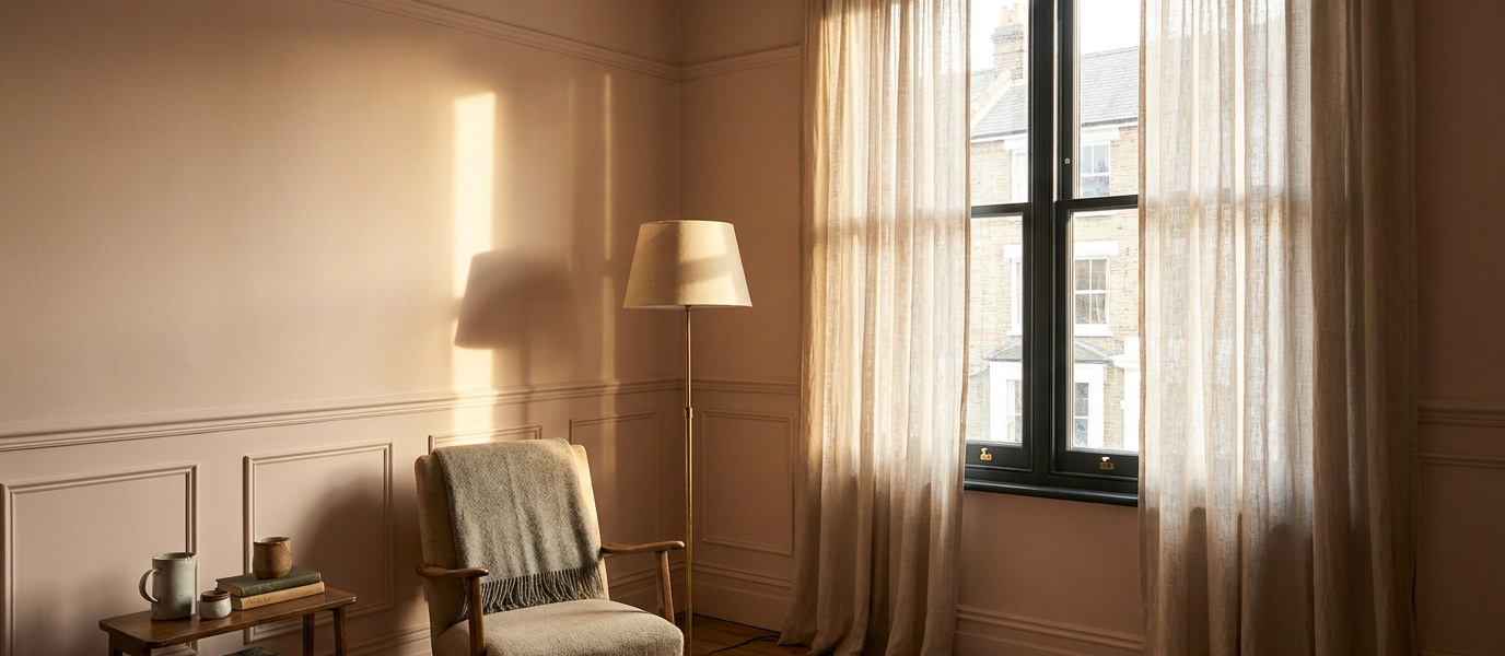
There’s a colour family that interior designers reach for when a room needs warmth without weight: pale pinks, peaches, and rose-tinted neutrals. These are not nursery pinks or Barbie pinks. They are the colour of a seashell held up to the light, or the inside of a ripe apricot. They catch the low sun of a late afternoon and hold it, softening edges, making a room feel as though it’s been dusted with warmth.
In a bedroom with tall sash windows, where the light arrives at an angle and stays low, a blush undertone can transform the quality of the hour before dusk. The walls don’t glow, that would be too much, but they seem to respond. A deep Setting Plaster pink, for instance, or a pale Farrow & Ball Drop Cloth, can make a room feel like it’s been wrapped in something soft. It’s the difference between a room that feels abandoned and one that feels held.
And here’s the thing that surprises most people: it works in north-facing rooms too. The cool light picks up the pink undertone and warms it, like adding a single log to a cold fire.
Three shades that do what white only promises
White promises brightness but often delivers flatness. These three colours actually deliver what white only hints at:
- A milky mushroom with a grey-green base. In low light, it reads as a soft, warm neutral, like the inside of a mushroom cap. In brighter light, the green undertone emerges, adding depth without gloom. It feels like a room that has been lived in for a hundred years, even if the plaster is fresh.
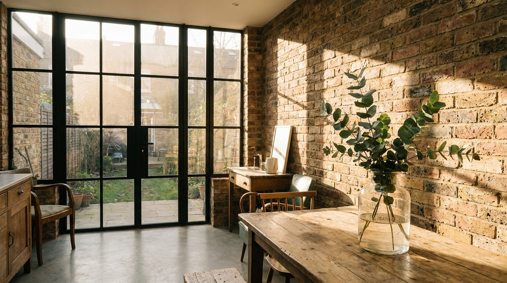
- A pale terracotta wash. This is the colour of sun-baked earth, but diluted until it’s barely there. It catches the golden hour and holds it, turning a north-facing kitchen into a room that seems to remember summer. It’s warm without being aggressive, and it makes wood, tables, floors, window frames, look richer.
- A cool stone with a blue undertone. This one is for the room that feels too cold. The blue in the paint matches the blue in the light, so instead of fighting it, the room becomes coherent, airy, calm, and surprisingly cosy. It’s the colour of a winter sky just before snow.
Each of these shades behaves differently at different times of day. That’s the point. They don’t sit still; they move with the light.
Let your windows do the heavy lifting
Paint can only do so much. If the light can’t reach the wall, the colour doesn’t matter. This is where your windows, their frames, their glazing, their proportions, become the unsung heroes of the scheme.
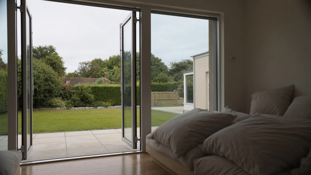
A well-placed window, or a clean, slim frame, allows the paint to do its job. A thick, heavy frame in a dark wood can swallow light before it touches the wall. A white-painted sash, by contrast, acts as a reflector, bouncing light onto the surface. And a flush casement, where the frame sits level with the wall, creates a smooth path for light to travel.
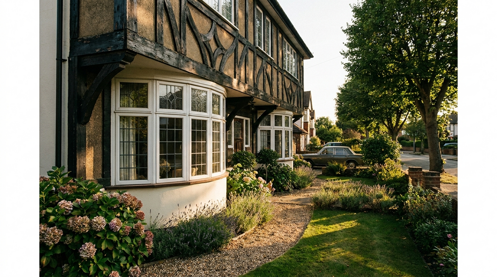
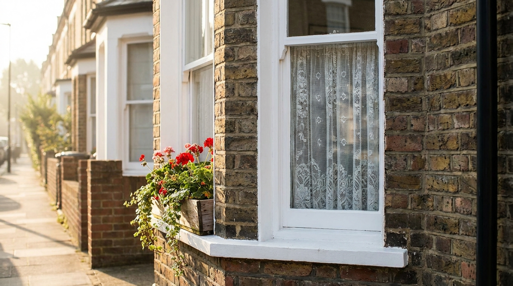
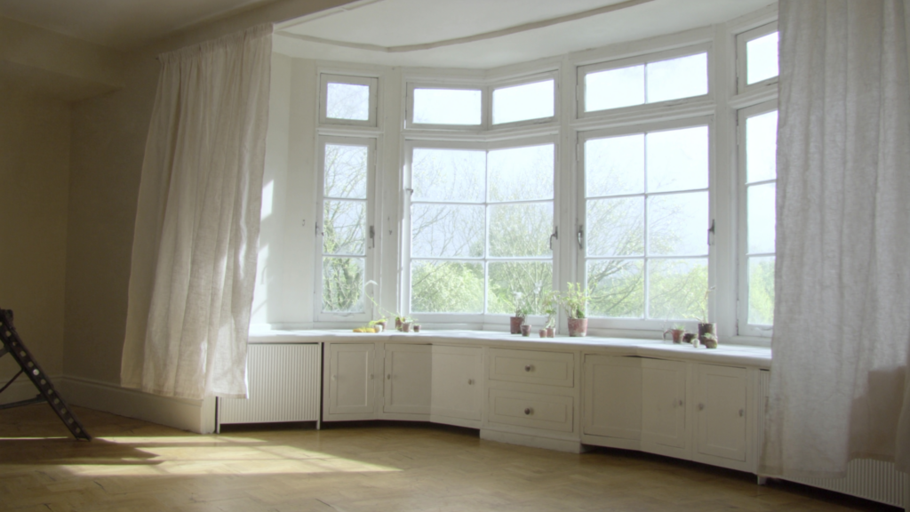
The proportions matter too. A tall sash window in a Victorian terrace sends light deep into the room, hitting the wall at an angle that shifts throughout the day. A wide, low casement in a 1930s bay spreads light horizontally, washing the wall in a steady glow. The same paint will look different in each.
And if you’re thinking about replacing your windows, consider the glazing. A modern double-glazed unit with a low-iron glass, the kind that doesn’t have that greenish tint, will let the true colour of your paint through. It’s a small detail, but in a north-facing room, it’s the difference between a colour that sings and one that sulks.
Why texture matters more than colour
Here’s a dinner-table observation that tends to surprise: a flat, matte finish can swallow light even from the most reflective colour. It’s like velvet, beautiful, soft, but hungry. It absorbs the light rather than bouncing it around the room.
A soft sheen or eggshell finish, on the other hand, behaves more like polished stone. It catches the light at certain angles and throws it back, creating a subtle glow that shifts as you move through the room. The difference is tactile as well as visual: a wall that feels like velvet versus one that feels like silk. Both have their place, but if your goal is to brighten a room without losing warmth, a gentle sheen is your friend.
And the surface itself matters. A room with period plaster, uneven, slightly absorbent, will respond differently to paint than a room with smooth modern walls. The light catches the imperfections, the small undulations, and the colour reads as deeper, more complex. A flat wall, by contrast, shows the colour as a single, unbroken tone. Both can be beautiful, but they ask different things of the paint.
Before you choose a shade, run your hand over the wall. Feel its texture. That will tell you more about how the colour will behave than any colour card ever could.
The room that stayed bright
Back in that north-facing kitchen, the one that refused to wake up, something changed. The clinical white came down. In its place went a warm, reflective neutral, a pale stone with a whisper of ochre, the kind of colour that doesn’t so much cover the wall as settle into it.
Now, at 4pm on a grey Tuesday, the room doesn’t wait for the sun. It makes its own. The light moves around the space, touches the edge of the windowsill, catches the grain of the wooden table, softens the corners. The room no longer feels like it’s borrowing time from another hour. It feels present, solid, alive.
It’s not magic. It’s just a better understanding of how light works, and a willingness to let colour, real colour, do what white only promises.