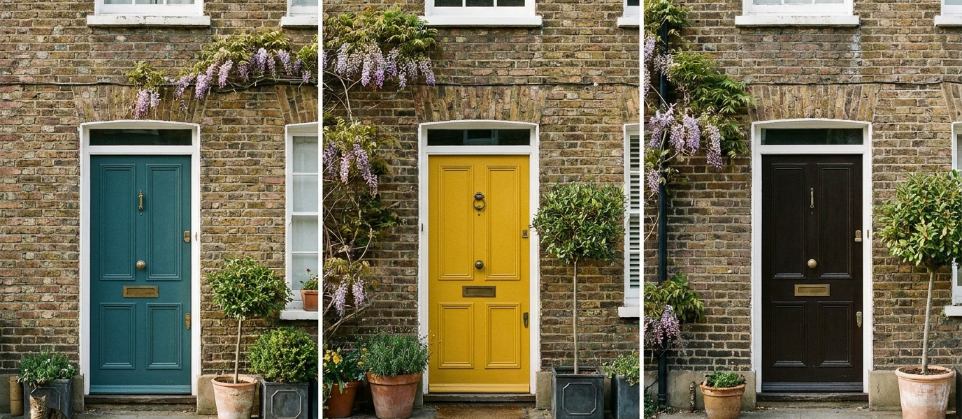
You’re turning the key in the lock, a late-October afternoon pressing in, grey sky, wet leaves, the smell of damp pavement. Your hand rests on the wood for a second longer than usual. The colour you chose six months ago is still holding its own against the weather, still doing something to the light that hits it. You don’t think about it often, but you feel it every time you come home.
That feeling is the quiet psychology of a front door. It’s not about what the neighbours think, or what the estate agent’s photographer will capture. It’s about the shift you make, twice a day, from public to private, and the colour that greets you at that threshold. Here’s how to choose a shade that works for you, not just for the street.
Let your front door do the heavy lifting
The front door is the only surface you touch every single day. Its colour works on you before you’ve stepped inside, sets a mood, signals a shift from public to private. This isn’t about curb appeal for visitors; it’s about how your own arrival feels, day after day, season after season.
Think of colour choice as a quiet emotional ritual, not a design statement. A door you love in the dim, quiet hour just before dawn will feel different at midday, and different again under a streetlamp. The best colours don’t shout; they hold a conversation with the light that hits them. If you’re looking for broader inspiration, door colour ideas can help you explore the spectrum.
Pick a colour that softens with the seasons
Natural pigments and matte finishes age gracefully, think faded ochre, soft olive, weather-washed slate. They look better in November than a glossy primary ever could. A glossy red door that pops in summer can feel harsh and demanding under a grey winter sky, like an exclamation mark where you wanted a full stop.
How light changes colour: a door that glows in summer sun can feel cold in winter grey. Choose a hue that holds warmth even in low light. A deep terracotta, for example, reads as burnt orange in autumn, almost brown in winter, and blooms back in spring. It’s a colour that lives with the year, not against it. The same principle applies to your windows, window colour trends can help you match the mood across your facade.
Why texture matters more than colour
A flat, glossy door in any shade can feel like a barrier. A textured surface, brushed metal, ribbed timber, hand-applied limewash, invites touch. The psychology of tactility is simple: rough surfaces feel honest, grounded; smooth feels distant. Your hand knows before your eye does.
Pair a muted colour with a tactile finish to create depth without shouting. A sage green on a reclaimed oak door, for instance, catches the light differently across its grain. A limewash finish in a soft clay pink feels almost warm to the touch, like sun-dried plaster. The texture does the work the colour might otherwise have to shout to achieve.
Eight ways to soften a tall sash window
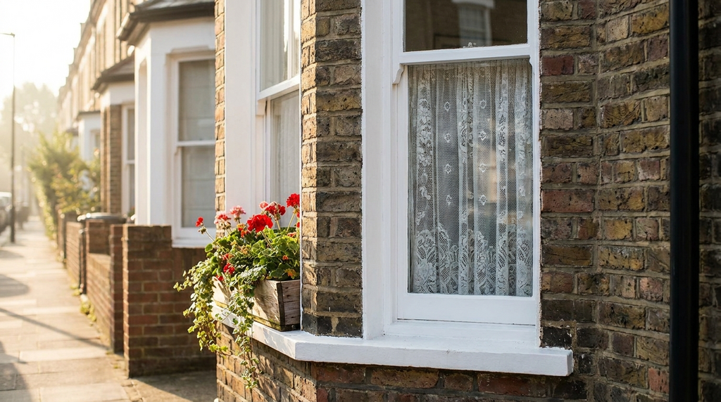
Tall windows next to a front door can feel imposing, especially on a Victorian or Georgian terrace. Use colour to balance them, paint the frame a shade lighter than the door, or echo the door’s undertone in the window sill. Here are eight ways to soften that vertical line:
- Paint the window frame a lighter version of the door colour
- Add a slim window box with trailing ivy or winter jasmine
- Hang a single lantern at eye level to break the vertical line
- Install a half-glazed door with a coloured panel below
- Use a matte finish on the window frame to reduce glare
- Place a stone urn or a low plant pot at the base of the window
- Choose a dark frame that recedes, letting the door take focus
- Add a soft Roman blind inside, visible through the glass
Each of these creates a pause, a moment for the eye to rest before the vertical drop. The door and window become a composition, not a competition.
The one colour that makes you slow down
Deep blue, not navy, not teal, but a blue that leans into grey, like a winter sea at dusk. Studies suggest it lowers heart rate and signals safety. Why it works: blue is the colour of the sky just before rain; it feels familiar, not demanding. It doesn’t compete with the garden or the street.
Pair it with warm brass hardware and a cream or stone threshold to keep it from feeling cold. A blue door says “welcome home” without raising its voice. It’s a colour that works on you before you’ve even reached the step, slowing your pace, softening your shoulders. For more on how to choose a shade that feels like yours, front door colour ideas offers a deeper dive.
What your door says about your home’s age
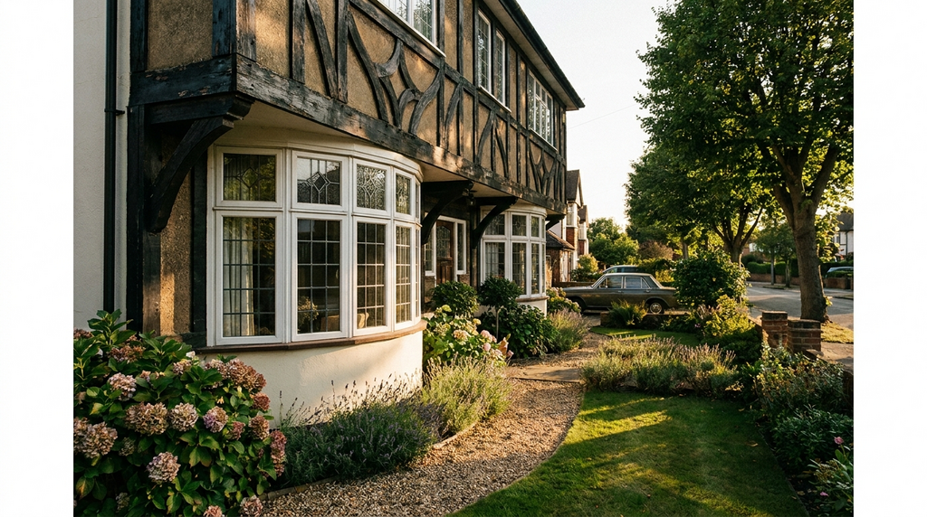
A Victorian terrace calls for a different palette than a 1930s semi or a modern extension. Respect the era without being a slave to it. For period homes, think softened black, dark green, or a muted ochre, colours that sit comfortably with original brickwork and ironmongery. For newer builds, warm grey, clay pink, or a faded mustard can bring character without pretending to be old.
The trick is to let the colour sit slightly behind the architecture, never louder than the brickwork or the original ironmongery. A deep Farrow & Ball Studio Green on a Victorian door feels right because it echoes the garden and the heavy stone threshold. A pale Little Greene French Grey on a 1930s semi respects the clean lines without shouting. The door should feel like it belongs, not like it’s trying to impress.
The quiet power of a dark door
Black, charcoal, or deep brown. These colours absorb light, making the entrance feel like a threshold, a transition. They work best with a single, strong detail, a brass knocker, a pale stone step, a single plant in a terracotta pot. The psychological effect is subtle but real: a dark door says “this is a private home,” not “come in and have a look.” It’s for the people who live there, not the street.
A dark door also makes the light that spills from your hallway feel warmer, more intentional. It frames the moment you step inside, turning a simple arrival into a ritual. And because it absorbs rather than reflects, it ages beautifully, no fading, no glare, just a quiet, steady presence that holds its own against the weather. For around £400 to £1,200 depending on size and finish, a dark, well-chosen door is one of the most cost-effective ways to reshape how your home feels, every single day.