Why your front door deserves a number that works as hard as you do
You know the moment. The Uber driver slows, leans forward, squints through the windscreen, then inches past your house before doubling back. Or the friend you’ve invited for dinner texts from the car: “Is it the one with the blue door or the one with the hedge?” You stand in the hallway, watching them fumble, and you think: that number has to go.
The old one, tarnished, undersized, a cheap plastic thing that came with the house, has been clinging on by a single screw for years. It’s the kind of number that says “someone put this here in 1987 and never thought about it again.” And every day, your front door greets the world. Delivery drivers, posties, emergency services, the person dropping off that sofa you bought on Facebook Marketplace. A clear, well-placed number saves them a moment of doubt. And that moment, when it’s a paramedic or a fire engine, matters more than you think.
Scale up, the rule of thumb your builder never told you
Most house numbers are undersized for their setting. It’s a quiet epidemic. Builders fit whatever came in the pack, and homeowners never think to swap them out. But here’s the visual trick: a number should be legible from the pavement, roughly ten to fifteen metres away, without anyone squinting. If you have to lean into the hedge to read it, it’s too small.
- Standard suburban setback: 15cm tall numbers. This is the sweet spot for most terraces and semi-detached homes.
- Recessed door or long path: 20cm or larger. If your front door sits back from the street, the number needs to shout from the kerb.
- Mounted directly next to a lit doorbell: 10cm is acceptable, but only just. The light does the heavy lifting here.
The psychology is simple: a generously scaled number signals confidence and care. It says someone lives here who pays attention. It’s the difference between “is this it?” and “right here.”
Let your front door do the heavy lifting, material pairings that click
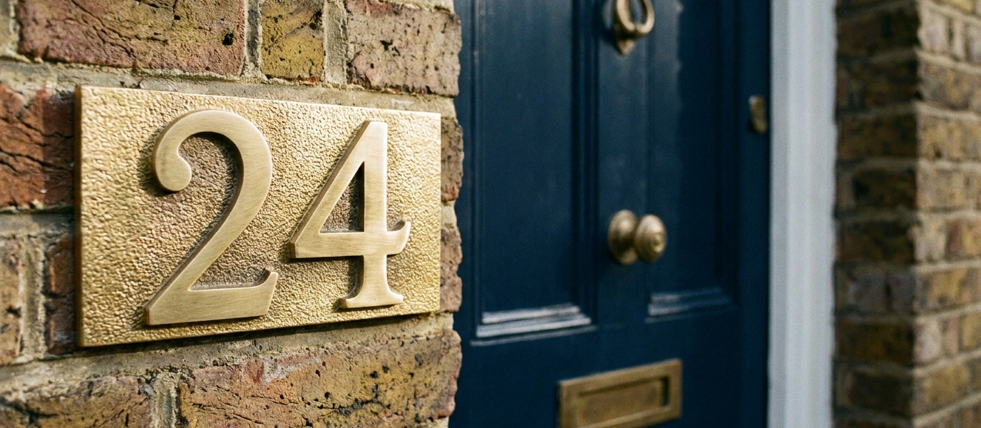
Match the number material to your door’s finish, or deliberately contrast it. The rule is intention, not accident. A brushed brass number on a dark timber door feels warm and grounded. Powder-coated black on white uPVC is crisp, modern, and quietly defiant. Aged copper on a painted brick surround catches the light like a worn coin.
The “why” is simple: a mismatch reads as an afterthought. Plastic gold on oak, the kind of number that comes in a blister pack from the hardware shop, says nobody cared enough to find the right thing. A considered pairing says the opposite. It’s the difference between a house that looks finished and one that looks like it’s still waiting for the final coat.
And on durability: outdoor-rated materials, solid brass, stainless steel, cast iron, will last decades. Stick-on vinyl numbers are a temporary fix, not a statement. They fade, peel, and curl at the edges. You’ll replace them in two summers. Spend the money once.
Pick a colour that softens with the seasons, not one that fades into the wall
Contrast is everything. A white number on a white door is invisible from the kerb, especially in the flat light of a British afternoon. A dark number on a dark door disappears at dusk. You need the number to sit against its background, not merge into it.
- Black on pale grey, clean, architectural, works on render or painted brick.
- Brushed nickel on navy, cool and refined, like a ship’s fittings.
- Aged bronze on cream, soft, earthy, and surprisingly legible in low light.
The seasonal angle: a matte finish catches soft autumn light in a way that feels almost velvety. A polished finish glints in summer sun like a wink. Both work, but choose one and commit. A half-polished, half-tarnished number just looks tired.
Eight ways to soften a tall sash window (and one that works for your number)
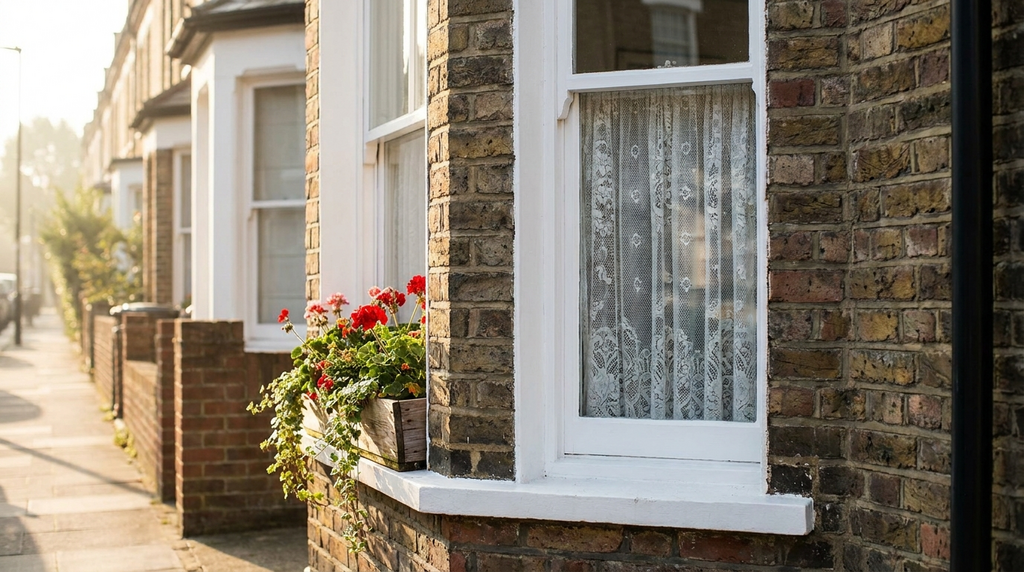
If your front door sits beside a tall Victorian or Edwardian sash window, the number placement becomes a design puzzle. You don’t want to obscure the glass, and you don’t want the number to look like an afterthought stuck to the frame. Here are eight approaches, and the one that works best for most homes.
- Mount the number at eye level on the brick pillar beside the window.
- Suspend a backlit number on a chain from the window frame, dramatic, but check the sightlines.
- Use a slim vertical number that echoes the sash’s proportions.
- Place it on the transom bar if the window is divided.
- Paint the number onto a small slate tile fixed to the sill.
- Use a cut-out number that lets light through, beautiful at night.
- Mount it on a wooden plaque stained to match the window frame.
- Attach it to the outer shutter hinge if you have shutters.
The one that works: number three. A vertical number respects the window’s height and draws the eye up, making the facade feel taller and more elegant. It’s a small trick, but it works every time.
Why texture matters more than colour, the touch test
A number that looks good in a photograph may feel cheap in person. Texture, brushed, hammered, sand-cast, adds depth that flat paint cannot replicate. It’s the difference between a print and a painting.
- A hand-painted ceramic number catches light differently from a laser-cut acrylic one. The glaze has a slight irregularity, a warmth that acrylic lacks.
- A cast iron number has a weight that signals permanence. You could drop it on your foot and feel the solidity.
- A wooden number carved by hand carries the grain of the tree. No two are exactly alike.
The human gain: when a guest runs a finger over your number, and they will, because people are tactile creatures, they feel the care you took. That tactile moment is the difference between a house and a home. It’s the detail that says “someone thought about this.”
Light it like you mean it, low-voltage, high-impact
A number that is invisible at night is a number that fails its purpose. You don’t need a floodlight; you need a gentle reveal. Solar-powered LED backlights, low-voltage spotlights from the porch ceiling, or a ring light around the number itself all work beautifully.
- Warm white (2700K): flattering to brick and timber. It softens the edges and makes the door feel welcoming.
- Cool white (4000K): works on modern render and glass. Crisp, clean, architectural.
- Avoid harsh blue-white: it makes the door look clinical, like a dentist’s waiting room.
The subtlety is everything. The light should reveal the number, not blind the visitor. A gentle glow from beneath the number, or a tiny LED strip inside a recessed letterbox, does the job without shouting. It’s the difference between being seen and being stared at.